Odd that the Underwood Deviled Ham logo is still here but the Pillsbury Man in the Moon with Stars was determined by an "odd crowd" to be satanic!
Most have updates, but don't completely lose the original idea.

-
WANTED: Happy members who like to discuss audio and other topics related to our interest. Desire to learn and share knowledge of science required. There are many reviews of audio hardware and expert members to help answer your questions. Click here to have your audio equipment measured for free!
You are using an out of date browser. It may not display this or other websites correctly.
You should upgrade or use an alternative browser.
You should upgrade or use an alternative browser.
I would actually say this is not true. At a high level engineering and graphic design have things in common.You must not be an engineer because they two skills are diametrically opposed LOL
An engineer is a type of designer, in that they come up with solutions to problems.
A graphic designer is also coming up with solutions to problems, but using different tools, and for different types of problems. However, the process shouldn't be radically different.
For a good design process (in any field), you start with the problem space - what is the design meant to achieve, what are the constraints, where will the design be used, etc. Then you propose possible solutions, build (prototype) at least one, and test it.
The "tool kits" of engineers and graphic designers are different, but the mindset isn't diametrically opposed at all, IMO it's almost the same.
I get an AVP vibe here “alien versus predator” ")
Otherwise nice work , imo the current logo combined colour scheme in brown combined with sheep’s that forms an illuminati triangle is terrible but charming because of what’s I come to represent . It’s mostly the current colour scheme ..
 9
9
Otherwise nice work , imo the current logo combined colour scheme in brown combined with sheep’s that forms an illuminati triangle is terrible but charming because of what’s I come to represent . It’s mostly the current colour scheme ..
OP
- Joined
- Jul 9, 2020
- Messages
- 407
- Likes
- 1,220
- Thread Starter
- #44
I get an AVP vibe here “alien versus predator”
Otherwise nice work , imo the current logo combined colour scheme in brown combined with sheep’s that forms an illuminati triangle is terrible but charming because of what’s I come to represent . It’s mostly the current colour scheme ..
View attachment 3478849

Great work, @Chagall !
I have a design background and I work as an architect/academic, so I'm glad to see this happening.
Your logo proposals are both great, but I prefer version B, where the S for science is more visible. I am always mindful of B/W printing or colour blindness, so version B works better overall.
Both versions remind me of some car or motorcycle brands. They look very 'dynamic'. I think that audio science is a more 'static' passion, hobby, discipline. Just a thought for you.
Great work again!
carpman
Member
- Joined
- Jun 10, 2023
- Messages
- 83
- Likes
- 53
+1V1B for me. Nice job!
I can't quite reach that far, but I have sent emissaries.I like the current "uterus" logo.
It feels inviting.
Great work, @Chagall!
Like @albertop, I must say that the shape of the letter S in proposal A is visibly comprimised. I also think it is important to retain the meaning of the logo when it is conveyed in monochrome.
That being said, I prefer version A.
Why? Well, I like the idea of a 'continous line'. It reminds me that,
If only the S shape in proposal A could be strengthened...Maybe a softer, less techy version.
One could be "inspired" to use the proporties of a waveform to design the logo

Like @albertop, I must say that the shape of the letter S in proposal A is visibly comprimised. I also think it is important to retain the meaning of the logo when it is conveyed in monochrome.
That being said, I prefer version A.
Why? Well, I like the idea of a 'continous line'. It reminds me that,
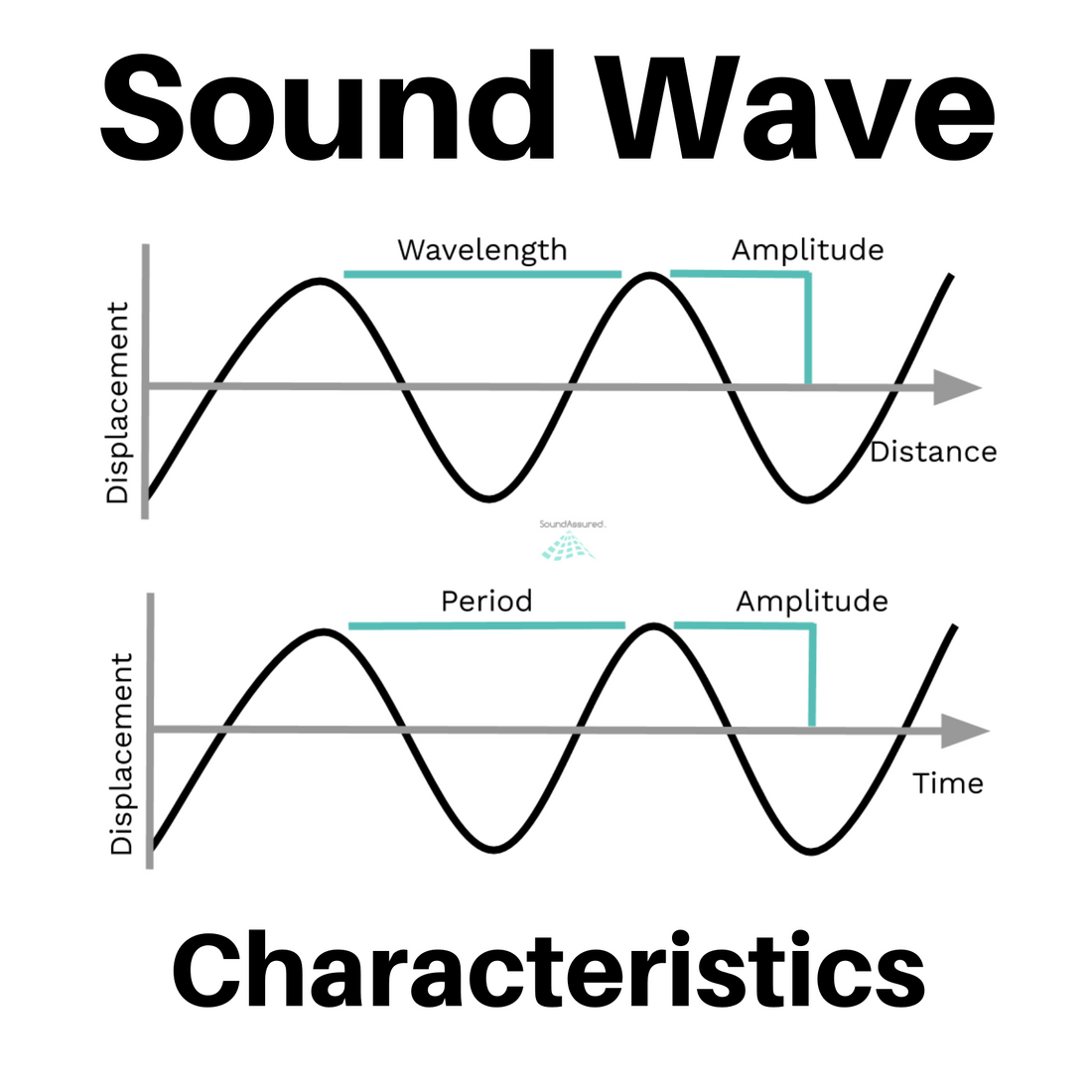
- audio is a signal and the waveform is the graphical representation of a signal or sound as it moves through a medium over time
- a continous line binds Subject, Framework and Context together (Audio-Science-Review)
If only the S shape in proposal A could be strengthened...Maybe a softer, less techy version.
One could be "inspired" to use the proporties of a waveform to design the logo
Last edited:
And all the other members who ran out of ways to say "DAC is transparent, it shouldn't sound like anything" are welcome
YES! I think you're on to something - like the best choices in DAC, amplifiers, etc., in all things in sound reproduction:
-How about a transparent logo!
In today's world of shrunken icons/logos for immediate identity, not sure the OPs suggestions would make it particularly stand out better than the current choice. I don't really care about any sort of keeping up with the Jones' logos on their own, but the little bit of identity I at least can associate with ASR without confusing with some other logo....
I had exactly the same reactions to the design elements, point by point, that you did, which I find interesting. I did not think there would be that much convergence in reactions to this sort of thing. To the OP, good work and thank you!Very cool effort!
You may not be surprised to find the crowd here is cranky about ... everything ... and so hopefully the comments aren't too unproductive here.
My personal thoughts / notes: The first logo reads more like "AVR" to me than "ASR", despite the coloration. To me this is a big risk in this space since "AVR" is a commonly used acronym here.
The second version reads like "ASR" but IMO the "R" is too broken-up so the legibility and overall look could be improved.
I think some variations on these might work better if the italics angle is a little smaller. Then you could pull the "R" together while keeping the basic elements of the A and S more or less how they are.
I do really like how you've treated the "Audio Science Review" text to the right of the "ASR". Feels clean and sophisticated. However, if I were to give my overall thought on the logo, it feels like it's trending a bit "tech" or "gamer" vs. "scientific reporting" so maybe there is some debate to be had about the branding cues going into the design, too.
Not an art director, but did an art minor in college, have worked in marketing for good while, done a bit of logo design myself when nobody else was available, and of course have participated in many design processes. In fact, there's been a branding or re-branding process at some point in every job I've had. A bit of a coincidence I guess. One opinion among many, just thought I should explain why I felt I had any reason to give more detailed feedback.
JSmith
Master Contributor
I've already got the t-shirt...
The effort is appreciated though.
JSmith
I was envisioning a silhouette of Amir standing on a mountain top, wearing flowing robes and with his hair majestically blowing in the wind. He holds the scales of justice, with ASR on one side of the scale and a large bottle of snake oil on the other...
...and right below, a silhouette of Danny designing a new 'crossover' and cable connectors to improve how the scales sound.
...and right below, a silhouette of Danny designing a new 'crossover' and cable connectors to improve how the scales sound.
I think just better psychedelics would be in order....I was envisioning a silhouette of Amir standing on a mountain top, wearing flowing robes and with his hair majestically blowing in the wind. He holds the scales of justice, with ASR on one side of the scale and a large bottle of snake oil on the other...
...and right below, a silhouette of Danny designing a new 'crossover' and cable connectors to improve how the scales sound.
Sorry no, looks like kia car logo or some other automotive design.
Keith_W
Major Contributor
I am curious who designed the current logo and what it means?
I used an online gallery of such logos for hire. Wanted something that conveyed something technical (hence the gear shapes). And that when made extremely small as to show up in the browser tabs, it would still be recognizable. And had to be cheap.I am curious who designed the current logo and what it means?
I also liked the colors as it gave me a pallet to choose from when creating other content.
D
Deleted member 48726
Guest
Keep the current one. It's distinct.
I can't recall any logo that resembles it much and that's a good thing for recognition, which is the point of having a logo!
I can't recall any logo that resembles it much and that's a good thing for recognition, which is the point of having a logo!
Similar threads
- Replies
- 2
- Views
- 770
- Replies
- 36
- Views
- 2K
- Poll
- Replies
- 46
- Views
- 3K
- Replies
- 91
- Views
- 9K