• WANTED: Happy members who like to discuss audio and other topics related to our interest. Desire to learn and share knowledge of science required. There are many reviews of audio hardware and expert members to help answer your questions. Click here to have your audio equipment measured for free!

New ASR logo proposal

Chagall

Senior Member
Forum Donor
Joined
Jul 9, 2020
Messages
406
Likes
1,215
Hi fellow ASR members,

for a while now I've been thinking about modernizing ASR logo and finally, I gave it a go.

First, a bit of context. I'm an art director working in the field for almost 20 years now in various design roles and wanted to give something back to ASR community. The logo seems to be the logical way forward.

The idea of this thread is to include the community in the discussion and if any members want to participate they are more than welcome to share their ideas and logo proposals. In time, Amir can go through the thread and see if there is something he likes. And just to be clear: Amir is under NO obligation here! If he sees something he likes - great, if he doesn't also great.

Without further ado, here are the proposals.

V1A
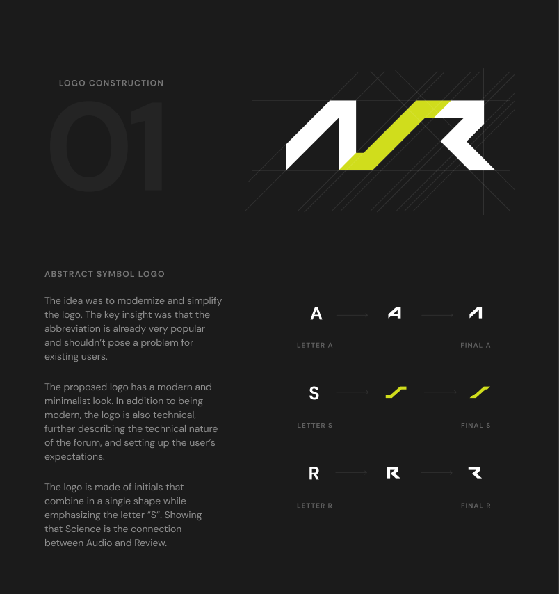

V1A.png

V1A2.png


V1B - similar to "A" but less abstract version.

V1B.png

V1B2.png


Full-sized images are attached in the .zip file.

Looking forward to the feedback and a fun discussion!
 

Attachments

  • ASR proposals.zip
    328 KB · Views: 40

Matias

Master Contributor
Forum Donor
Joined
Jan 1, 2019
Messages
5,087
Likes
10,946
Location
São Paulo, Brazil
V1B for me. Nice job!
 

kemmler3D

Major Contributor
Forum Donor
Joined
Aug 25, 2022
Messages
3,352
Likes
6,866
Location
San Francisco
Very cool effort!

You may not be surprised to find the crowd here is cranky about ... everything ... and so hopefully the comments aren't too unproductive here.

My personal thoughts / notes: The first logo reads more like "AVR" to me than "ASR", despite the coloration. To me this is a big risk in this space since "AVR" is a commonly used acronym here.

The second version reads like "ASR" but IMO the "R" is too broken-up so the legibility and overall look could be improved.

I think some variations on these might work better if the italics angle is a little smaller. Then you could pull the "R" together while keeping the basic elements of the A and S more or less how they are.

I do really like how you've treated the "Audio Science Review" text to the right of the "ASR". Feels clean and sophisticated. However, if I were to give my overall thought on the logo, it feels like it's trending a bit "tech" or "gamer" vs. "scientific reporting" so maybe there is some debate to be had about the branding cues going into the design, too.

Not an art director, but did an art minor in college, have worked in marketing for good while, done a bit of logo design myself when nobody else was available, and of course have participated in many design processes. In fact, there's been a branding or re-branding process at some point in every job I've had. A bit of a coincidence I guess. One opinion among many, just thought I should explain why I felt I had any reason to give more detailed feedback.
 
Last edited:

just1n

Active Member
Forum Donor
Joined
Feb 2, 2021
Messages
138
Likes
117
Don’t know how to word it, but maybe softer and clearer. It’s a very interesting logo, but looks more like a symbol than an acronym.

Color coding the review categories? Big thumbs up there.
 

syzygy

Member
Joined
Feb 26, 2023
Messages
18
Likes
53
I’ve grown to love the sheep. Keep the sheep :)
SHEEP! I always saw it as a gear (or gears) with, idk - leaves?

Now I can't not see sheep.

Maybe keep the original 3 colors?
....and maybe add a little bit of sheep to the new logo?
(or not, because if they are gears, that might reinforce the KIA+TYPER automotive reference?)

I certainly like the free design service you're providing to Amir!
 

radix

Major Contributor
Joined
Aug 1, 2021
Messages
1,409
Likes
1,346
V1B also, if I had to pick one.

You could also do ASR as a lolipop graph :)
 
OP
Chagall

Chagall

Senior Member
Forum Donor
Joined
Jul 9, 2020
Messages
406
Likes
1,215
Very cool effort!

You may not be surprised to find the crowd here is cranky about ... everything ... and so hopefully the comments aren't too unproductive here.

My personal thoughts / notes: The first logo reads more like "AVR" to me than "ASR", despite the coloration. To me this is a big risk in this space since "AVR" is a commonly used acronym here.

The second version reads like "ASR" but IMO the "R" is too broken-up so the legibility and overall look could be improved.

I think some variations on these might work better if the italics angle is a little smaller. Then you could pull the "R" together while keeping the basic elements of the A and S more or less how they are.

I do really like how you've treated the "Audio Science Review" text to the right of the "ASR". Feels clean and sophisticated. However, if I were to give my overall thought on the logo, it feels like it's trending a bit "tech" or "gamer" vs. "scientific reporting" so maybe there is some debate to be had about the branding cues going into the design, too.

Not an art director, but did an art minor in college, have worked in marketing for good while, done a bit of logo design myself when nobody else was available, and of course have participated in many design processes. In fact, there's been a branding or re-branding process at some point in every job I've had. A bit of a coincidence I guess.

Hey, thanks for the comment!
Me, being an art director only means I have years of experience in taking criticism :)

Yes, you are right about the first version. It is on the edge of being too abstract.

I can try with a smaller angle for the second version. About the branding cues - that is a conversation on its own, but for now, I just wanted to get the ball rolling.

Everything you said makes sense. When can we expect your proposal? :)
 

theREALdotnet

Major Contributor
Joined
Mar 11, 2022
Messages
1,202
Likes
2,076
SHEEP! I always saw it as a gear (or gears) with, idk - leaves?

Now I can't not see sheep.

Interesting. It always reminded me of a knitting and haberdashery shop.
 

Salt

Addicted to Fun and Learning
Forum Donor
Joined
Aug 7, 2023
Messages
616
Likes
341
Location
DE
Sheep? Never wasted a thought on it, but: that's true :oops:.
The design: very stylish, but is it worth an effort for this bunch of old white men with decreasing abiltity of sight and hearing ;).
Just curious as 'senior member' :cool:.
 
OP
Chagall

Chagall

Senior Member
Forum Donor
Joined
Jul 9, 2020
Messages
406
Likes
1,215
SHEEP! I always saw it as a gear (or gears) with, idk - leaves?

Now I can't not see sheep.

Maybe keep the original 3 colors?
....and maybe add a little bit of sheep to the new logo?
(or not, because if they are gears, that might reinforce the KIA+TYPER automotive reference?)

I certainly like the free design service you're providing to Amir!

Original colors are used in categorizing reviews. It would be too much to have them all at the same time.

1707254100122.png


1707254070854.png
 
OP
Chagall

Chagall

Senior Member
Forum Donor
Joined
Jul 9, 2020
Messages
406
Likes
1,215
Sheep? Never wasted a thought on it, but: that's true :oops:.
The design: very stylish, but is it worth an effort for this bunch of old white men with decreasing abiltity of sight and hearing ;).
Just curious as 'senior member' :cool:.

Well, we need to engage the juniors somehow!:)
 

RayDunzl

Grand Contributor
Central Scrutinizer
Joined
Mar 9, 2016
Messages
13,250
Likes
17,199
Location
Riverview FL
For additional introspection...

ASR_Logo.png
 

kemmler3D

Major Contributor
Forum Donor
Joined
Aug 25, 2022
Messages
3,352
Likes
6,866
Location
San Francisco
Me, being an art director only means I have years of experience in taking criticism :)
I am sure you know this, but this is one of the most important and most under-developed - you might even say downright rare skills out there, so I have a lot of respect for that experience. :)
When can we expect your proposal?
Uh, well, it would take a lot of time away from me giving random semi-qualified advice about speakers and rooms, you see. :D

I am also not sure as to what brand Amir wants to project, as he'd be the presumptive principal client here. If it were up to me, I'd want to position ASR as "not just another forum / blog / audio rag". The key idea behind ASR is you get a lot more facts and a lot less opinion than the alternatives. So the visual branding would be set apart from mainstream tech / audio somehow. I might borrow something from scientific publications, maybe ranging from Popular Science to Nature, or even vanguard basic-research-type tech companies like the various nuclear fusion startups out there.

Just one guy's opinion, but somehow I never have trouble forming opinions if someone asks... :D
 
OP
Chagall

Chagall

Senior Member
Forum Donor
Joined
Jul 9, 2020
Messages
406
Likes
1,215
Uh, well, it would take a lot of time away from me giving random semi-qualified advice about speakers and rooms, you see. :D

Come on, do it. There is no deadline, no commitments, and most of all it is supposed to be fun :)

And all the other members who ran out of ways to say "DAC is transparent, it shouldn't sound like anything" are welcome:)

If it were up to me, I'd want to position ASR as "not just another forum / blog / audio rag". The key idea behind ASR is you get a lot more facts and a lot less opinion than the alternatives. So the visual branding would be set apart from mainstream tech / audio somehow.

Yeah, but that is also a risk. Leaning hard into science and away from mainstream tech can alienate new members. It all depends on Amir's goals that's for sure.
 

Chester

Senior Member
Joined
May 22, 2021
Messages
443
Likes
1,071
Hi fellow ASR members,

for a while now I've been thinking about modernizing ASR logo and finally, I gave it a go.

First, a bit of context. I'm an art director working in the field for almost 20 years now in various design roles and wanted to give something back to ASR community. The logo seems to be the logical way forward.

The idea of this thread is to include the community in the discussion and if any members want to participate they are more than welcome to share their ideas and logo proposals. In time, Amir can go through the thread and see if there is something he likes. And just to be clear: Amir is under NO obligation here! If he sees something he likes - great, if he doesn't also great.

Without further ado, here are the proposals.

V1A
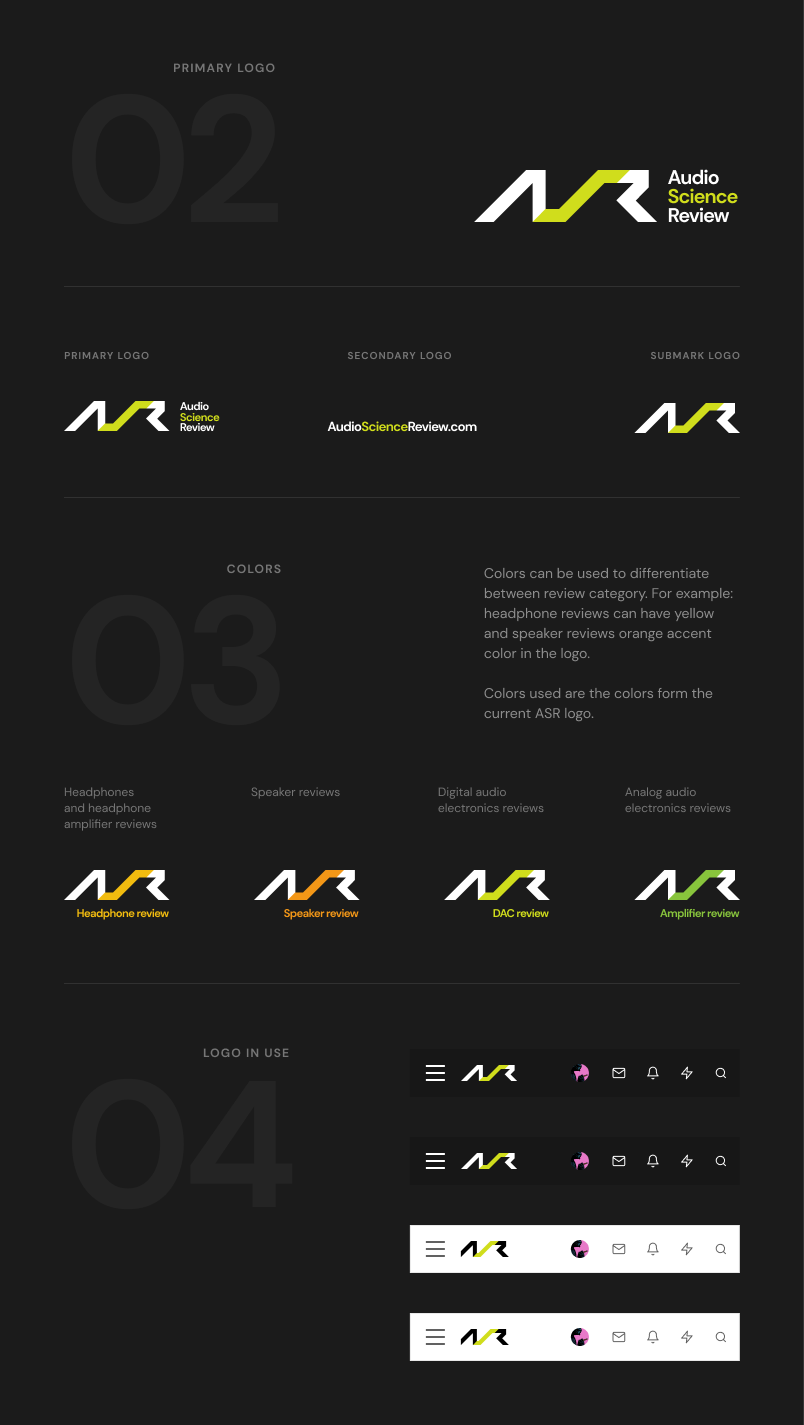

View attachment 347831
View attachment 347832


V1B - similar to "A" but less abstract version.
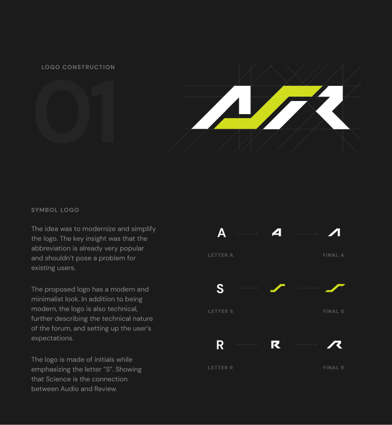
View attachment 347833
View attachment 347835

Full-sized images are attached in the .zip file.

Looking forward to the feedback and a fun discussion!

Very nice efforts @Chagall
 
Top Bottom