D
Deleted member 48726
Guest
Oh. Need to look at better pictures then. Looks like dipped chocolate on my phone..16k € & the black and white tops are leather.
Oh. Need to look at better pictures then. Looks like dipped chocolate on my phone..16k € & the black and white tops are leather.
Cool looking speaker, and the design seems reasonably sensible. Their older, now seemingly discontinued Davone Grande also looked nice:This was released just recently. Davone Reference One. Something about wide ovoid baffle seems very elegant to me, seems like this could measure very well aswell.
View attachment 271263
Love the colour selection:Not sure if these have been posted before. Kef Blade.

.
View attachment 269006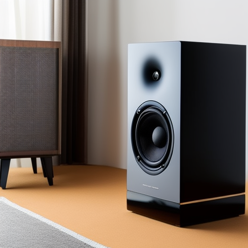
View attachment 269005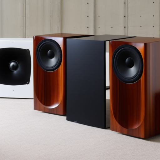
View attachment 269004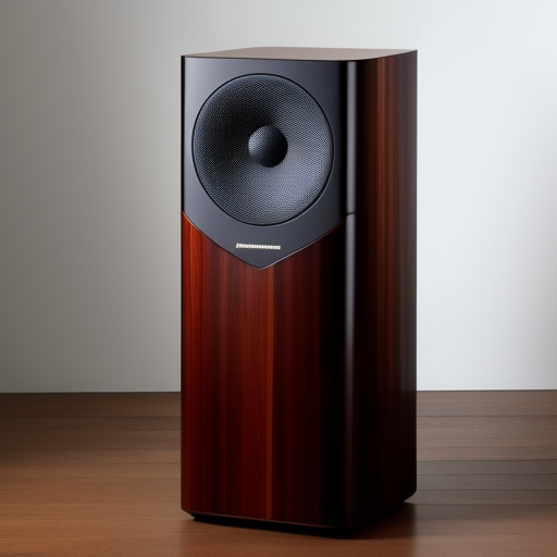
View attachment 269008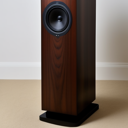
None of these exist. "Most beautiful speakers". Text to image AI from dezgo.com.
The above were generated by Stable Diffusion 2.1. Pretty interesting. Here's a Most Beautiful Integrated Amplifier....
View attachment 269010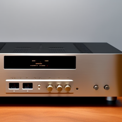
When I chose to render the same text in Vintedois Diffusion the following resulted..
View attachment 269009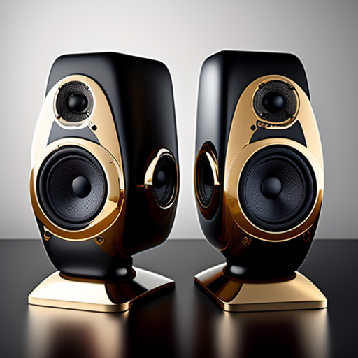
View attachment 269007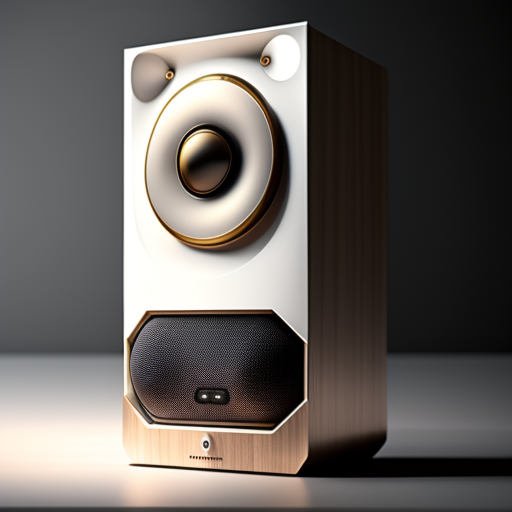
This is interesting. And a little hilarious. It highlights the different approaches, and source "learning" material that various IE image generation models employ. Vintedois seems to be aiming for the sci fi fantasy anime user. That's would seem to be much of what its model has digested from the web and learned from. Hence the more garish and fanciful. And the vaguely facial featured components and unmistakably perky "protuberances" on that last speaker?
Hilarious
Love the colour selection:

Focal has much better colorsLove the colour selection:

.
View attachment 269006
View attachment 269005
View attachment 269004
View attachment 269008
None of these exist. "Most beautiful speakers". Text to image AI from dezgo.com.
The above were generated by Stable Diffusion 2.1. Pretty interesting. Here's a Most Beautiful Integrated Amplifier....
View attachment 269010
When I chose to render the same text in Vintedois Diffusion the following resulted..
View attachment 269009
View attachment 269007
This is interesting. And a little hilarious. It highlights the different approaches, and source "learning" material that various IE image generation models employ. Vintedois seems to be aiming for the sci fi fantasy anime user. That's would seem to be much of what its model has digested from the web and learned from. Hence the more garish and fanciful. And the vaguely facial featured components and unmistakably perky "protuberances" on that last speaker?
Hilarious
Focal has much better colors
What these guys miss is the "as easy as possible" attitude. The visual design is as bad as it possibley might get. It is just pretentive, and that was it, full stop.Cool looking speaker, and the design seems reasonably sensible. Their older, now seemingly discontinued Davone Grande also looked nice:View attachment 271329
but didn't measure so well from what I've seen, which might be why it's no longer on their website.
By the way above are the colours of the first generation, below are the ones from the Blades Meta:Love the colour selection:

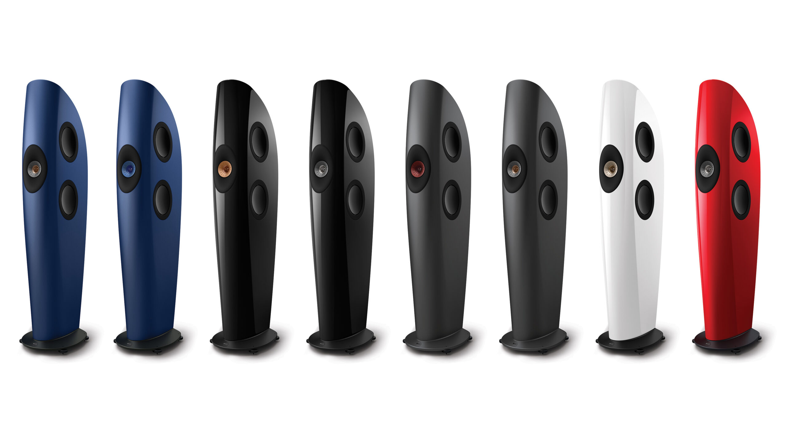
Much more sensible colours imoBy the way above are the colours of the first generation, below are the ones from the Blades Meta:

How are you fixed for Blades? (a shaving commercial line). I think it was Gillette, maybe might have been Schick, I am not sure which. I liked Gillette's theme song, which was played during their commercials on televised boxing matches.Focal has much better colors
AI generally, especially in LLMs like chatgpt and text to image models, is exploding right now. Every week now they offer up something astonishingly new, and/or deeply unsettling. I think the only people who are not actively discussing them right now have simply not met them yet. Maybe the amazement will wear off, or maybe not for quite a while.OMG, I'm now at least momentarily addicted to that AI program!
For instance I'm currently designing a speaker base, as well as a volume knob for a remote control, so I can put in all sorts of combinations "black speaker base with gold streaks" or "brass volume knob, wood top" and it spits out these often beautiful renderings!
A "Most Beautiful" designation is always going to frustrate 10 percent of us. Its the nature of "taste".
Asking a random sampling of one hundred people which of the following vehicles is the more beautiful I'm pretty confident that 90 of them would say it's the second one
View attachment 268272
View attachment 268276
So make of that what you will. But I find a similar bias in the speaker designs I commonly find described as notably beautiful. I suspect, even before clicking on the link that I'm going to see more of the second value expressed than the first image above. How to make it even-more-beautiful? Add more bling! Chrome! Sculpted facets! Spaceship lenses.
I hate to go off-topic, but I gotta ask, did you actually receive one? what was the order/receive lag?Did you post the photos in the wrong order because that blue thing is ghastly. Then again I like our Rivian:
View attachment 271978
Martin
I hate to go off-topic, but I gotta ask, did you actually receive one? what was the order/receive lag?