- Joined
- Jan 23, 2020
- Messages
- 4,342
- Likes
- 6,718
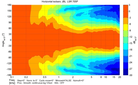
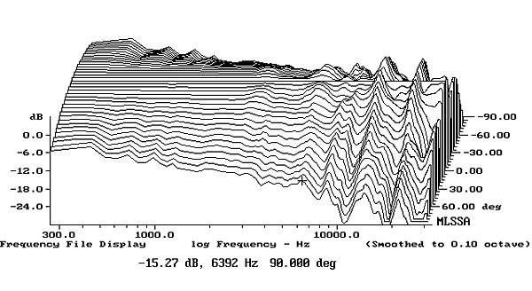
For me, the normalized plots are better for quickly assessing how consistent the directivity is. The non-normalized plots are more useful to me for quickly assessing how wide or narrow a speaker's dispersion is, though I personally find Erin's globe view even better for that. Tbh, you can kinda get all the information from all the graph styles if you study it close enough and consider other graphs. When I say one way is "better" for certain uses, I mainly just mean that my brain can get the information it's looking for faster. The "quickness" with which my brain can process it is important, since I really only use them for "quick" comparisons. As @napilopez said, for more exact comparisons (say looking for 1-2dB differences in particular ranges), the off axis SPL graphs are better.
I don't think there's a wrong/right answer here. I just think different people's brains work differently. The fact that we have people on both sides to me just says that both are useful to at least someone.
I don't think there's a wrong/right answer here. I just think different people's brains work differently. The fact that we have people on both sides to me just says that both are useful to at least someone.