-
Welcome to ASR. There are many reviews of audio hardware and expert members to help answer your questions. Click here to have your audio equipment measured for free!
You are using an out of date browser. It may not display this or other websites correctly.
You should upgrade or use an alternative browser.
You should upgrade or use an alternative browser.
Two possible new puppies in Aiyimas future..
- Thread starter Schlippwhip68
- Start date
Count Arthur
Major Contributor
- Joined
- Jan 10, 2020
- Messages
- 2,838
- Likes
- 7,134
Number 2, but get rid of the serif font, and have the screen in amber, red, green or white, anything but blue. 
they cant do thatNumber 2, but get rid of the serif font, and have the screen in amber, red, green or white, anything but blue.
the screen is a commodity part used on a slew of Chinese products
its ugly as hell but.. it works
Schlippwhip68
Addicted to Fun and Learning
- Thread Starter
- #44
Cool.I wouldn't personally discourage them from getting feedback on designs... it's best practice to have your target audience evaluate potential IDs, but it's fairly slow and expensive to do it in other ways. I'd rather that they do this than the most likely alternative, which is to do no testing at all and let some executive with questionable taste have final say.
Nobody has to respond to the survey, if you think it's leech-like behavior then just keep scrolling.
Schlippwhip68
Addicted to Fun and Learning
- Thread Starter
- #45
Yeah, the Serif font doesn't really match the rest of the design. Helvetica would be very nice...they cant do that
the screen is a commodity part used on a slew of Chinese products
its ugly as hell but.. it works
Last edited:
Schlippwhip68
Addicted to Fun and Learning
- Thread Starter
- #47
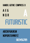
Helvetica font (standard) in white or Amber/Orange in todays options would look better and suit the design of 2 much better imo but the Handel Got font would make it a classic...imo...and check the colour scheme in the sample photo, it's just so easy to look at...what I would call an 'all day design'. Something the eyes wouldn't grow tired with. How easy it would be to implement a beige background with the powder blue (white or black) with the Handel Got font is another story...Number 2, but get rid of the serif font, and have the screen in amber, red, green or white, anything but blue.
Attachments
Last edited:
Schlippwhip68
Addicted to Fun and Learning
- Thread Starter
- #49
Pit Pony.Due to the nature of my job, designs like #1 always remind me of the power supplies on my desk.
View attachment 379955
Schlippwhip68
Addicted to Fun and Learning
- Thread Starter
- #50
Could be unless its Bluetooth only with Analogue line in XLR/RCA.
Helvetica font (standard) in white or Amber/Orange in todays options would look better and suit the design of 2 much better imo but the Handel Got font would make it a classic...imo...and check the colour scheme in the sample photo, it's just so easy to look at...what I would call an 'all day design'. Something the eyes wouldn't grow tired with. How easy it would be to implement a beige background with the powder blue (white or black) with the Handel Got font is another story...
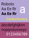
@AIYIMA Roboto is an open source font that looks similar to Helvetica and would be superior to the default font you are using.
Schlippwhip68
Addicted to Fun and Learning
Schlippwhip68
Addicted to Fun and Learning
- Thread Starter
- #54
Roboto font is cleaner than Helvetica, I still prefer Handel Got myself but yes Roboto has cleaner lines than the Helvetica and is more neutral than Handel Got so it could be the better choice long term rather than a classic/special edition. Personally much prefer the beige background and powder blue colour scheme than the colour scheme in this photo of the Roboto font. Good input GXAlan!@AIYIMA Roboto is an open source font that looks similar to Helvetica and would be superior to the default font you are using.
Attachments
Last edited:
Roboto font is cleaner than Helvetica, I still prefer Handel Got myself but yes Roboto has cleaner lines than the Helvetica and is more neutral than Handel Got so it could be the better choice long term rather than a classic/special edition. Personally much prefer the beige background and powder blue colour scheme than the colour scheme in this photo of the Roboto font. Good input GXAlan!
I like Handel, but since it’s a commercial font, it costs money to use.
Robots is open source, so I assume it is free for commercial use with attribution.
Cute little pidlers.
Guddu
Major Contributor
- Joined
- Feb 10, 2020
- Messages
- 1,501
- Likes
- 1,465
These are more like graphical models, they would not have given 2 options if one of those have had become reality by that time.It is an opinion on two finished designs by the looks of it, so most of the hard work is already done evidently.
KaeliKoo
Active Member
SMSL just put a really nice looking and easy to read 1.9" LCD screen with white & amber on the B2 unit it sells for $80.
I would think adding a decent screen like that would be pretty do-able and doesn't add much cost.
I would think adding a decent screen like that would be pretty do-able and doesn't add much cost.
Guddu
Major Contributor
- Joined
- Feb 10, 2020
- Messages
- 1,501
- Likes
- 1,465
Model pic has BT, if it indeed has BT then a high power amplifier might not need it.High-power amplifier.
and I guess you aren't willing to detail the amplifier chip info here yet?
Similar threads
- Replies
- 78
- Views
- 15K
- Replies
- 11
- Views
- 1K
- Replies
- 123
- Views
- 44K
- Replies
- 2
- Views
- 3K

