• WANTED: Happy members who like to discuss audio and other topics related to our interest. Desire to learn and share knowledge of science required. There are many reviews of audio hardware and expert members to help answer your questions. Click here to have your audio equipment measured for free!

New ASR logo proposal

syzygy

Member
Joined
Feb 26, 2023
Messages
18
Likes
53
Surprisingly I don't mind this one and isn't making me think of Chrome actually;

View attachment 349497

Could be viewed as "bringing together" in a way... but probably still prefer ol' Cecil the sheep. :)


JSmith
I like the fuller ring of text around the center. I think I'd like it better with the dots replaced with the leaf-shaped features for continuity with the old existing logo.

Still like the white/blue scope logo (but with rectilinear graph background)

Of course, I'd also miss the sheep (even though I've only know were sheep for a few days now)
 

JSmith

Master Contributor
Joined
Feb 8, 2021
Messages
5,224
Likes
13,479
Location
Algol Perseus
I'd also miss the sheep
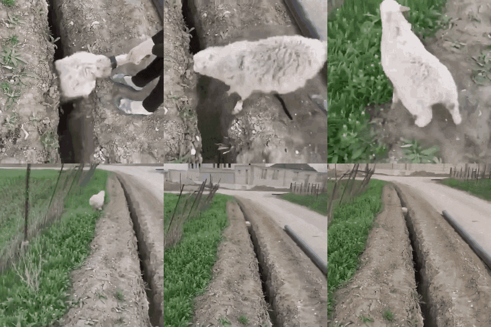
Speaking of missing sheep;

sheep-jump.gif


Poor ol' sheep. :facepalm:


JSmith
 

pseudoid

Master Contributor
Forum Donor
Joined
Mar 23, 2021
Messages
5,197
Likes
3,546
Location
33.6 -117.9
Science is in the name ;) This forum is about the application of science rather than scientific research.
Damn scientists think they own the world!
In hindsight, Engineers for Audio Review (EAR) just would not have been catchy enough.

ADD: @Chagall, my finger hurts from giving your posts "Likes".
 
Last edited:

Chromatischism

Major Contributor
Forum Donor
Joined
Jun 5, 2020
Messages
4,808
Likes
3,749
An attempt to break the monotony...

1707858086438.png
I think this is cool. However, I also think logos need to be in 2D.

As a hobbyist designer, I ask myself "What works best when I zoom way the F out". Naturally the otherwise really cool measurement-themed icons are too busy to work. Even this one which is otherwise my favorite so far:

Updated version. Simpler and thicker lines


View attachment 349632

I think your simplifications could work, though.

I also think that the analog knob is a brilliant take but doesn't look like anything but a white dot when zoomed out so I don't think is recognizable enough. My opinion, of course.
 

Galliardist

Major Contributor
Joined
Jun 26, 2021
Messages
2,558
Likes
3,277
Location
Sydney. NSW, Australia
I think this is cool. However, I also think logos need to be in 2D.

As a hobbyist designer, I ask myself "What works best when I zoom way the F out". Naturally the otherwise really cool measurement-themed icons are too busy to work. Even this one which is otherwise my favorite so far:


I think your simplifications could work, though.

I also think that the analog knob is a brilliant take but doesn't look like anything but a white dot when zoomed out so I don't think is recognizable enough. My opinion, of course.
I’m looking at some of these suggestions, and the current logo and mobile site design right now on my iPhone: all are too small. The current logo looks like three splodges on the menu bar and the site name is vaguely readable only if you know what it says. The logos being presented would be great on the side of a building (well, I guess we could aspire to a three storey lab some day) but the logo’s main purpose is as a fav icon, a small image in Google mobile search results and that mobile site menu bar.

What sort of logo/icon works? Well, check out the Australian ABC mobile site. Very simple, monochrome and clear on the screen. I’m not suggesting copying it, but it shows what really works.

When is the ASR logo going to be displayed at a size that’s in most of the design suggestions even? I’d suggest starting with the smallest size it will be shown: make it bold and scale it up rather than down.
 
OP
Chagall

Chagall

Senior Member
Forum Donor
Joined
Jul 9, 2020
Messages
406
Likes
1,215
I’m looking at some of these suggestions, and the current logo and mobile site design right now on my iPhone: all are too small. The current logo looks like three splodges on the menu bar and the site name is vaguely readable only if you know what it says. The logos being presented would be great on the side of a building (well, I guess we could aspire to a three storey lab some day) but the logo’s main purpose is as a fav icon, a small image in Google mobile search results and that mobile site menu bar.

What sort of logo/icon works? Well, check out the Australian ABC mobile site. Very simple, monochrome and clear on the screen. I’m not suggesting copying it, but it shows what really works.

When is the ASR logo going to be displayed at a size that’s in most of the design suggestions even? I’d suggest starting with the smallest size it will be shown: make it bold and scale it up rather than down.

Proposals are exported on 48 - 60px for desktop, 32px for mobile, and 16px favicon. The smallest version is always the simplest (and nothing is final). If some proposals don't have smaller versions (dial, ear, or graph/measurement proposal) it's just that I didn't have the time to do it yet - not that they won't have it :)

1708006816901.png

1708006444839.png


Or 60px desktop here:
1708006268945.png


Initial version:
1708007681299.png


And yes I agree, the current logo is too small and too intricate on mobile.
 

A Cute Earring

Active Member
Joined
Jun 27, 2022
Messages
113
Likes
353
Location
USA
Proposals are exported on 48 - 60px for desktop, 32px for mobile, and 16px favicon. The smallest version is always the simplest (and nothing is final). If some proposals don't have smaller versions (dial, ear, or graph/measurement proposal) it's just that I didn't have the time to do it yet - not that they won't have it :)

View attachment 349749
View attachment 349744

Or 60px desktop here:


Initial version:


And yes I agree, the current logo is too small and too intricate on mobile.
Looks like bikini bottom science review. ;-)
 

Galliardist

Major Contributor
Joined
Jun 26, 2021
Messages
2,558
Likes
3,277
Location
Sydney. NSW, Australia
Except these gears literally can't turn, giving off the vibe of conflicting ideas that don't work together.
I could suggest that the forum, at least, is all about conflicting ideas that don’t work together :rolleyes:
 

Galliardist

Major Contributor
Joined
Jun 26, 2021
Messages
2,558
Likes
3,277
Location
Sydney. NSW, Australia
Well – a logo is not about what is but what the issuer wants people to believe what is.
I know. I wrote several posts around that already. If you’ve been following the thread.

I also commented earlier that the site is much more than the forum, and that the logo should reflect the purpose and the whole. It’s why I liked the ear as a concept.

My post you replied to was meant to be ironic. Sorry I didn’t convey that clearly enough.
 
Top Bottom