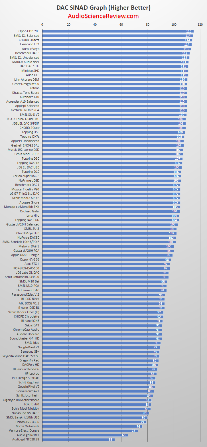
The regular horizontal SINAD chart is getting out of control with smaller and smaller text size. So an alternative is to have it vertically. Here is what I have. Let me know if it works better for you:

-
Welcome to ASR. There are many reviews of audio hardware and expert members to help answer your questions. Click here to have your audio equipment measured for free!
You are using an out of date browser. It may not display this or other websites correctly.
You should upgrade or use an alternative browser.
You should upgrade or use an alternative browser.
How do you like this SINAD Chart Style?
- Thread starter amirm
- Start date
- Joined
- Feb 23, 2016
- Messages
- 23,571
- Likes
- 44,413
About 400% better. Keep it this way.
Suggestion. Maybe color code the bars. Break it into 110+, 100+, 90+, 80+ and everything below 80 gets red bars.
Suggestion. Maybe color code the bars. Break it into 110+, 100+, 90+, 80+ and everything below 80 gets red bars.
- Joined
- Feb 23, 2016
- Messages
- 23,571
- Likes
- 44,413
No I disagree. The cream rises to the top.Looks unsteady, maybe turn upside down?
- Thread Starter
- #6
I reversed the order as otherwise, worst performing ones would be on top/getting attention. But yes, emotionally it feels like it is going to fall over.Looks unsteady, maybe turn upside down?
- Thread Starter
- #7
Anyone know how to do this automatically in excel?Suggestion. Maybe color code the bars. Break it into 110+, 100+, 90+, 80+ and everything below 80 gets red bars.
Much better!
P.S. Where are the RME ADI-2s on the list?
P.S. Where are the RME ADI-2s on the list?
- Joined
- Feb 23, 2016
- Messages
- 23,571
- Likes
- 44,413
I'd have to work out the details, but some if-then functions on formatting would do it. Not too terribly hard.Anyone know how to do this automatically in excel?
Arnandsway tutorial is basically the same idea.
Both RME ADI-2 DAC and Pro were measured before APx555 and no SINAD was calculated.Much better!
P.S. Where are the RME ADI-2s on the list?
Both units are recommended and quite popular.
Amir, it would be great if you can remeasure at least one of them and put in on a chart.
^ yes, agree!
The regular horizontal SINAD chart is getting out of control with smaller and smaller text size. So an alternative is to have it vertically. Here is what I have. Let me know if it works better for you:
View attachment 21482
MMMMMMMMMMMMMMMMUUUUUUUUUUUUUUUUUUUUUUUUUUUUUUUUUCCCCCCCCCCCCCCCCCCCCCCCCCHHHHHHHHHHHHHHHHH
better
- Thread Starter
- #14
My Pro version is not the "FS" so not sure how useful it is to put in the chart. A local person though has the DAC and I plan to get and measure it next month.Amir, it would be great if you can remeasure at least one of them and put in on a chart.
svart-hvitt
Major Contributor
- Joined
- Aug 31, 2017
- Messages
- 2,375
- Likes
- 1,265
Top of the pops
Pro non-FS is also would be cool to have on a chart.My Pro version is not the "FS" so not sure how useful it is to put in the chart. A local person though has the DAC and I plan to get and measure it next month.
I've attached a sample, simple workaround file. It uses a simple formula and some conditional formatting to obtain the desired result, and you won't even have to maintain a chart anymore, as it's all done in-cellAnyone know how to do this automatically in excel?
Attachments
Habu
Active Member
Hello from France
Looks like the golden age of DAC is here.
Sincerely yours
Habu
Looks like the golden age of DAC is here.
Sincerely yours
Habu
Last edited:
Excel's conditional formatting will do it automatically...
Similar threads
- Replies
- 6
- Views
- 3K
- Replies
- 160
- Views
- 29K
- Replies
- 18
- Views
- 3K
- Replies
- 6
- Views
- 966
