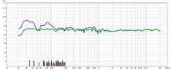
Your scaling of the vertical SPL axis is 140 dB which makes even the worst response look good. Change the vertical scaling to 100 dB at the top and 50 dB at the bottom. Also, to get a better sense of how well your room treatments are working, post the RT60 graph.