• WANTED: Happy members who like to discuss audio and other topics related to our interest. Desire to learn and share knowledge of science required. There are many reviews of audio hardware and expert members to help answer your questions. Click here to have your audio equipment measured for free!

New ASR logo proposal

OP
Chagall

Chagall

Senior Member
Forum Donor
Joined
Jul 9, 2020
Messages
406
Likes
1,215
OK – here’s something super simple and abstract.

Among the three color variants in the second line there’s even a Make America Great Again version: the one on the right :D

PS: We must never show this to Deutsche Bank, of course :cool:

View attachment 348760

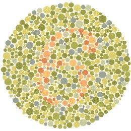
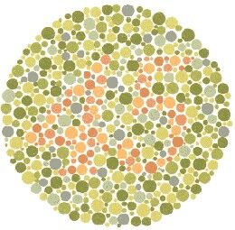
It's funny how the ASR color scheme creates a visual overload - don't work well together. ASR logo sort of gets away with it because the colors don't overlap.
But here with the colors overlapping, it's like taking a color-blind test. You need to look away and rest your eyes on the blue & red.

colorblind-test-image5.jpg
colorblind-test-image9.jpg
 

BlackTalon

Addicted to Fun and Learning
Forum Donor
Joined
Apr 14, 2021
Messages
595
Likes
953
Location
DC
"ASR's Thong of Truth will expose those in hi-end audio who talk out of their a$$"
 

tomchris

Active Member
Joined
May 14, 2021
Messages
210
Likes
415
Location
Denmark

@Chagall, I like the most simple variant of the original logo. Although, it reminds me of a Boba Fett helmet, for some reason:)

However, I am also reminded of the Mercedes logo, representing the company’s drive for universal motorization. The star's three points represent land, sea and air.

My own take on renewing the old logo, would be a stylized Venn diagram of the logo, perhaps using letters, symbols, or rectangles as elements. Here the specific colors could represent Audio, Science and Review.

Another take could be a roundel, like the ones commonly used on military aircraft, as seen on the WW2 Spitfire aircraft.
It is simple and clean. Each circle color would represent Audio, Science and Review.
 
Last edited:

Galliardist

Major Contributor
Joined
Jun 26, 2021
Messages
2,558
Likes
3,278
Location
Sydney. NSW, Australia
Can we try the ear again, maybe in a more natural/realistic way?
 

Puddingbuks

Addicted to Fun and Learning
Forum Donor
Joined
May 31, 2020
Messages
590
Likes
989
V1b is difficult to read / understand for many people.
 

Galliardist

Major Contributor
Joined
Jun 26, 2021
Messages
2,558
Likes
3,278
Location
Sydney. NSW, Australia
That may be overemphasizing the subjective listening. Remember, this is the measuring club!
This is the SCIENCE forum. There is a difference. We are here (pun intended) to understand the full audio experience, and that includes what happens in subjective listening. Measurement is only one of the pillars.
 

Multicore

Major Contributor
Joined
Dec 6, 2021
Messages
1,788
Likes
1,964
IMHO, an example of a logo with intrinsic meaning is Yamaha's three tuning forks.
This has been a favorite of mine since I became familiar with it around 1980. Friends had it on their instrument cases and then later so did I. Then HiFi and motorcycles and now again guitars. It's a great little design, just cryptic enough that it can also function as an abstract decoration depending how you look at it.
 

JP

Major Contributor
Joined
Jul 4, 2018
Messages
2,296
Likes
2,475
Location
Brookfield, CT
Bottom left is the cleanest evolution with the least progression away from the identity. Gears are too last decade for a modern logo.
 

Blumlein 88

Grand Contributor
Forum Donor
Joined
Feb 23, 2016
Messages
20,781
Likes
37,657
Bottom left is the cleanest evolution with the least progression away from the identity. Gears are too last decade for a modern logo.
Man I did not know. Gears are out of fashion. Sorry about that.

Ready KiloWatt has been around since 1926. Made of electric bolts or electricity. Could we adapt that kind of logo style or is it way too dated?
1707669996573.png
 
Top Bottom