• WANTED: Happy members who like to discuss audio and other topics related to our interest. Desire to learn and share knowledge of science required. There are many reviews of audio hardware and expert members to help answer your questions. Click here to have your audio equipment measured for free!

New ASR logo proposal

voodooless

Grand Contributor
Forum Donor
Joined
Jun 16, 2020
Messages
10,406
Likes
18,367
Location
Netherlands
Many successful brand logos mean nothing and/or have nothing to do with the subject as well... and that's just *why* they are so good, IMHO.
Nike,
They ultimately selected the mark now known globally as the Swoosh, a shape inspired by the wings of the Greek goddess Nike.
see: https://en.wikipedia.org/wiki/Swoosh
Seems to be the result of random stripe testing, it just looked good that way.
The combination of red, white, and dark blue inside a spherical shape looks incredibly appealing due to a “smile” effect, created by the white swirl inside the sphere.
See: https://1000logos.net/pepsi-logo/
Mercedes-Benz,
Together, the Mercedes-Benz star’s 3 points represent the company’s drive for universal motorization — but each point also has its individual meaning. The points represent land, sea, and air — environments the company believed they would one day dominate with Mercedes-Benz engines.
See: https://www.mercedesbenzportland.com/manufacturer-hub/the-mercedes-benz-logo-explained/
The Opel emblem symbolizes cars that go so fast that you barely have time to notice them. The shine and metal of the emblem are a prototype of the power and speed that distinguish the cars of this brand. The sign hints at modern technologies that help in driving the car.
See: https://logos-world.net/opel-logo/
... the not noticing part is true for sure :facepalm:
Instagram,
It's literally a camera.. What more meaning do you want?
Starbucks, ....
Heckler was inspired by a Norse woodcut of a two-tailed siren from the 16th century. “It’s a metaphor for the allure of caffeine, the sirens who drew sailors into the rocks,”
See: https://www.shopify.com/blog/starbucks-logo

All of these things mean something :)
 

Matias

Master Contributor
Forum Donor
Joined
Jan 1, 2019
Messages
5,088
Likes
10,947
Location
São Paulo, Brazil
Nike's to me obviously means a check mark, correct, accepted, doing the right thing. Both in winning or training, or maybe correct choice of brand to brag to others. Genius.
 

Golf

Senior Member
Joined
Sep 4, 2022
Messages
416
Likes
289
The meaning of a logo is to fulfill a purpose, as it is defined by it’s creator / owner. The ways to achieve this are numerous, to say the least ...
 

JSmith

Master Contributor
Joined
Feb 8, 2021
Messages
5,224
Likes
13,481
Location
Algol Perseus
1707477499216.png


JSmith
 

Crosstalk

Senior Member
Joined
Dec 13, 2021
Messages
465
Likes
242
I like the general idea of having a new logo. But to me, it would be more apt, if it represents what this forum stands for in some ways. The forum approaches sound in a more scientific way. Instead of stylish letters, can't we have something like a sine wave, some speaker drivers anatomy or something similar incoorporated into the actual letters. Otherwise we keep the sheep as it is, as its just fun like the panthers.
 

pkane

Master Contributor
Forum Donor
Joined
Aug 18, 2017
Messages
5,708
Likes
10,397
Location
North-East
Many successful brand logos mean nothing and/or have nothing to do with the subject as well... and that's just *why* they are so good, IMHO.
Nike, Adidas, Pepsi, Mercedes-Benz, Opel, Instagram, Starbucks, ....


If you don't *know* beforehand that these weird graphical elements shall resemble letters then you'd never guess it (the same is true for OP's first example. I do know -- prior knowledge aka bias -- that it is an abstract version of the letters ASR but the characters are deformed beyond any recognition).

It could be anything but doesn't have any sense of distinct style One of the worst logo attempts I've ever seen, sorry.

All of the above strictly IMHO, I do understand we all have different preferences and likings.

I agree. The goal of a successful logo is to be remembered and to be instantly recognized among other logos. A stylized lettering, like in the OP, no matter how well done, is still just a bunch of letters. It's not memorable nor easy to spot among many other logos that use a similar approach and similar style.

The original logo has the uniqueness going for it, and the distinct, very recognizable color and style. While it may not be easy to interpret, that isn't even in the top 10 desirable properties of a good logo design.

So, Keep The Sheep! :)
 

Scytales

Active Member
Forum Donor
Joined
Jan 17, 2020
Messages
142
Likes
210
Location
France
Hi fellow ASR members,

for a while now I've been thinking about modernizing ASR logo and finally, I gave it a go.

First, a bit of context. I'm an art director working in the field for almost 20 years now in various design roles and wanted to give something back to ASR community. The logo seems to be the logical way forward.

The idea of this thread is to include the community in the discussion and if any members want to participate they are more than welcome to share their ideas and logo proposals. In time, Amir can go through the thread and see if there is something he likes. And just to be clear: Amir is under NO obligation here! If he sees something he likes - great, if he doesn't also great.

Without further ado, here are the proposals.

V1A


View attachment 347831
View attachment 347832


V1B - similar to "A" but less abstract version.

View attachment 347833
View attachment 347835

Full-sized images are attached in the .zip file.

Looking forward to the feedback and a fun discussion!
To me, this proposals, especially the inclination of the letters to the right, which suggests movement, evokes motoring more than anything related to sound or science.
 

Multicore

Major Contributor
Joined
Dec 6, 2021
Messages
1,787
Likes
1,958
1. I've really enjoyed this thread. I've had many good laughs.

2. I think the sheep's fine as it is. It does the job and is already well recognized. That and the color scheme here goes with our frumpy nature.

3. Branding is often gross; it's calculated, manipulative, subliminal mind-control. So anything that can subvert this, like a comedy sheep, or a hirsute bikini bottom, is good with me.

4. Thanks to @Chagall for starting this. No disrespect. Really. It was brave to submit your work to this crowd and it turned into a very enjoyable thread.

5. Keep the thread going!
 

BlackTalon

Addicted to Fun and Learning
Forum Donor
Joined
Apr 14, 2021
Messages
595
Likes
953
Location
DC
How about going with an ear-like graphic and adding a phrase like "If you know you know" or even better "Don't go broke compensating for your small cochlea"
 

nerdemoji

Active Member
Joined
Jul 17, 2023
Messages
194
Likes
301
Wake up, SHEEPLE, you are being deceived by the Audio “Science” thought police. Don’t let your life be controlled by the “good” measurements and fake things like Directivity that don’t exist in the real world.
 

kemmler3D

Major Contributor
Forum Donor
Joined
Aug 25, 2022
Messages
3,357
Likes
6,880
Location
San Francisco
I agree. The goal of a successful logo is to be remembered and to be instantly recognized among other logos.
Memorability and recognizability are key success criteria for a good logo, but it also needs to successfully visualize the "personality" and core ideas of the brand. A good logo tells your customer something, or at least puts them in the proper mindset, at a glance.

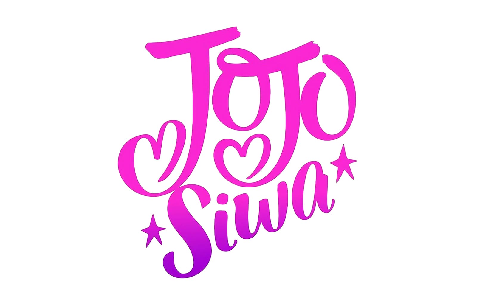
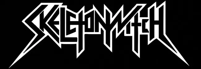
For example, these are both perfectly good logos for two famous musical acts:

Jojo-Siwa-Logo.jpg
a20791a144e21c3e59a78c_l__72323140754198512801280_display_large_367073.webp


But they would NOT be good logos if they traded fonts. ;)
 

Blumlein 88

Grand Contributor
Forum Donor
Joined
Feb 23, 2016
Messages
20,772
Likes
37,639
Well might as well throw in one. Yes my vector graphics skills are awesome :facepalm:

If you wanted a change something simple. Colors, fonts etc could be adjusted.

1707503623357.png


Small image on phones might be an issue. One of the strengths of the current logo.
1707503675332.png
 
Top Bottom