• WANTED: Happy members who like to discuss audio and other topics related to our interest. Desire to learn and share knowledge of science required. There are many reviews of audio hardware and expert members to help answer your questions. Click here to have your audio equipment measured for free!

New ASR logo proposal

pkane

Master Contributor
Forum Donor
Joined
Aug 18, 2017
Messages
5,741
Likes
10,484
Location
North-East
Memorability and recognizability are key success criteria for a good logo, but it also needs to successfully visualize the "personality" and core ideas of the brand. A good logo tells your customer something, or at least puts them in the proper mindset, at a glance.

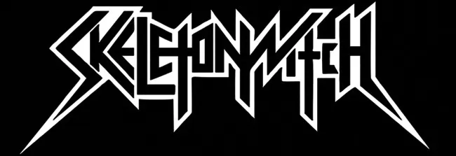
For example, these are both perfectly good logos for two famous musical acts:
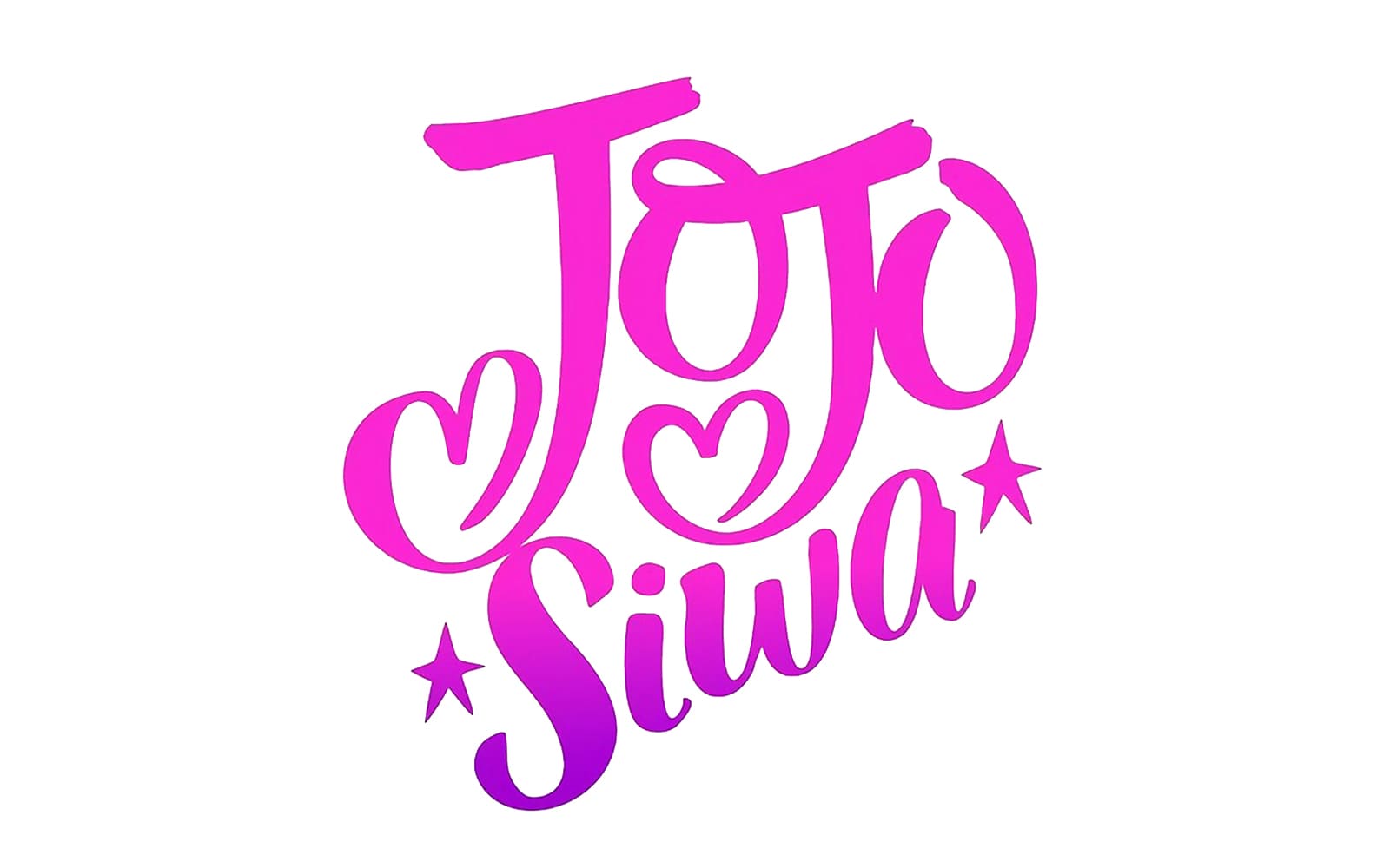
Jojo-Siwa-Logo.jpg
a20791a144e21c3e59a78c_l__72323140754198512801280_display_large_367073.webp


But they would NOT be good logos if they traded fonts. ;)

I thought a good "personality" visualization was already posted ;)


1707505702980.png
 
Last edited:

KSTR

Major Contributor
Joined
Sep 6, 2018
Messages
2,849
Likes
6,390
Location
Berlin, Germany
The problem is that the current logo is far too intricate, and adding additional elements will result in this View attachment 348419 when displayed at a smaller size (on mobile - I'm guessing that's like 60%-70% of users). The current logo needs a simplified small version and an even simpler favicon.
The sheep now has grown a pig nose, haha! ;-)
 

KSTR

Major Contributor
Joined
Sep 6, 2018
Messages
2,849
Likes
6,390
Location
Berlin, Germany
It's literally a camera.. What more meaning do you want?
I didn't recognize a camera (it does *not* look like the typical camera icons, not even the basic proportions), and if it's actually meant to resemble one, why does it have the trigger on the "wrong", left hand side (as seen from the operator)?
 

voodooless

Grand Contributor
Forum Donor
Joined
Jun 16, 2020
Messages
10,507
Likes
18,569
Location
Netherlands
and if it's actually meant to resemble one, why does it have the trigger on the "wrong", left hand side (as seen from the operator)?
Maybe it’s the AF assist lamp ;)

1707506477479.jpeg
 

DMill

Addicted to Fun and Learning
Forum Donor
Joined
Jan 9, 2022
Messages
952
Likes
1,353
Nobody has formed ASR out of speaker cable yet? We all know how critical It is to good sound. On that note I wonder what lifted veils look like?
 

tomchris

Active Member
Joined
May 14, 2021
Messages
210
Likes
416
Location
Denmark
Yes, taste is subjective, but of all the colors available, why brown as the main forum color?
I didn't recognize a camera (it does *not* look like the typical camera icons, not even the basic proportions), and if it's actually meant to resemble one, why does it have the trigger on the "wrong", left hand side (as seen from the operator)?
The 2nd and present Instragram logo, designed by Cole Rise, was inspired by a Bell & Howell camera. The first Instragram logo started out as an image of a Polaroid OneStep camera.
 
Last edited:

pseudoid

Master Contributor
Forum Donor
Joined
Mar 23, 2021
Messages
5,283
Likes
3,674
Location
33.6 -117.9
202402_ASR-Logo.png

I'd rather see the ASR logo a bit more to-the-point; where:
*The outer circle truly becomes a saw-blade,
*The inner triangle is rounded out,
*A clef is inserted to resemble eyes/mouth,
*The lower 4 arrow-points deleted,
*The top 2 arrows are sharpened to look like horns, and
*(optionally) A big, red "ban the" slash across the whole thing.


"Cut the Bull in Audio!"
:facepalm:
 

IAtaman

Major Contributor
Forum Donor
Joined
Mar 29, 2021
Messages
2,440
Likes
4,271
1+ to "Keep The Sheep", or if you are into acronyms, KTS.

The current logo, to me,
  • is very one-of-a-kind (the whole point of a logo, isn't it?), the symmetry and the proportions feel just right
  • is easily recognized immediately after the first time you see it, without the need to truly understand what it actually depicts
  • is a truly graphical icon with carefully selected color scheme rather than just a generic pile of random letters in some random font
  • is very organic and natural, generally easy to the eye (no brutalism), and has details to explore when zooming in
  • still sticks out clearly even at smallest sizes where letters would just blur and melt, and it works on almost any background without the need of an integrated background
  • has that nice trivia aspect to it, the sheep thing. The ambiguity makes it interesting and creates a perfect mnemonic bridge

Hard to beat, IMHO it's a true master piece as it checks so many boxes. Small updates non-withstanding, of course.
I can't tell if you are serious or is this a parody of a subjective audio reviews?
 

IAtaman

Major Contributor
Forum Donor
Joined
Mar 29, 2021
Messages
2,440
Likes
4,271
Many successful brand logos mean nothing and/or have nothing to do with the subject as well... and that's just *why* they are so good, IMHO.
Nike, Adidas, Pepsi, Mercedes-Benz, Opel, Instagram, Starbucks, ....
That is incorrect.
Starbucks logo is literally a siren, which has a meaning on its own, and is supposed to symbolize the allure of caffeine.
Nike logo is famously inspired and supposed to look like the wings of the Greek goddess of victory Nike.
One of the strongest brand logos in the world is Coca Cola, which is just a generic pile of random letters in some random font.
All logos have a meaning, or designed to convey a meaning, or associated with one retrospectively sometimes. That's what a logo is.
 
Last edited:

KSTR

Major Contributor
Joined
Sep 6, 2018
Messages
2,849
Likes
6,390
Location
Berlin, Germany
I can't tell if you are serious or is this a parody of a subjective audio reviews?
No, I'm being 100% serious here and just reported what I see and feel.
That is incorrect.
Starbucks logo is literally a siren, which has a meaning on its own, and is supposed to symbolize the allure of caffeine.
Nike logo is famously inspired and supposed to look like the wings of the Greek goddess of victory Nike.
One of the strongest brand logos in the world is Coca Cola, which is just a generic pile of random letters in some random font.
All logos have a meaning, or designed to convey a meaning, or associated with one retrospectively sometimes. That's what a logo is.
Of course everything has a meaning but my point was it's not self evident, the logo does not directly carry the meaning. You have to acquire background knowledge and make guesses before there is any meaning. Textual-only logos like Coca-Cola are off the table as there is no meaning to transport other than the words/letters themselves, by definition.

BTW, note that you own wording is "supposed to symbolize" etc so it looks like it's not at all that clear...

IMHO, an example of a logo with intrinsic meaning is Yamaha's three tuning forks. You don't need someone to school you on what it's supposed to mean and what the context is.
The Instagram logo would also qualify if were less abstract.
 

-Matt-

Addicted to Fun and Learning
Joined
Nov 21, 2021
Messages
680
Likes
571
IMHO, an example of a logo with intrinsic meaning is Yamaha's three tuning forks. You don't need someone to school you on what it's supposed to mean and what the context is.

The meaning isn't so obvious when you first see it on a motorcycle! :)

Had no idea they were supposed to be tuning forks until someone told me. And these days I bet very few youngsters have ever seen a tuning fork. Even if they are musicians they probably use digital tuning devices.
 
Last edited:

voodooless

Grand Contributor
Forum Donor
Joined
Jun 16, 2020
Messages
10,507
Likes
18,569
Location
Netherlands
Textual-only logos like Coca-Cola are off the table as there is no meaning to transport other than the words/letters themselves, by definition.
Not at all. Do you think the logo would be as iconic if it were in Times New Roman? Any shape and color combination can purvey meaning.

Red color means strength, passion, love and energy. White color – purity, youth, nobility.
See: https://turbologo.com/articles/coca-cola-logo/
 
Top Bottom