Hey everyone. Long time lurker, first post here. Thanks for all the measurements and information that you Amirm, and others (Solderdude among others) share freely. I always use this website before buying anything.
I figured I’d post my review on these headphones, from the pov of an audio engineer. I do mostly acoustic folk indie to hard rock to electronic downtempo.
I apologise, this review turned out into a massive wall of text. I am writing this while having the flu, and I don’t have the energy to summarize further. Maybe later, but for now it’s just my blurted out thoughts.
TLDR Summary: I think these headphones are great for mixing engineers, the best I’ve come across the DT’s, MDR’s and HD’s. But I haven’t had them all and I claim no authority. I also think they are good value for money too if you like the looks, and the build quality seems excellent. I agree with the general assessment that they are deficient in bass for enjoyment for rock, EDM, RnB and DnB type genres, but I find that they are great for folk, classic, anything where midrange timbre is of higher importance. I’d recommend these for mixing engineers who use headphones predominantly, and not only to zoom in on certain area’s (while you of course could).
About my usecase:
I mix on headphones. I’ve done so all my life and it comes a lot easier to me than for engineers who “make the switch” from speakers. But I’ve noticed two consistent issues with my mixes over the years: bass and width.
- Bass comes across in that mixes just don’t translate in the area below 100Hz. Sometimes too loud, sometimes not enough.
- The same goes for width, and the perceived loudness between sources in the middle (lead vocal, snare for example) and things panned to the sides (pads, backing vocals etc).
So I specifically want headphones that are stronger than that than my current faves, the closed back Sony MDR-1A (with custom EQ profile).
A short bit about Harman targets in mixing:
So from an mixing standpoint, I’ve often tried mixing with a Harman (2019, over ear) target, following the logic of “mix towards what your listeners hear”, but the issue is that I just can’t get bass accurately translate. With a straight bass response, I find it much easier to simply hear if the balance is right and it’s also easier to compare to reference tracks. Rather than rely on the ‘visceralness’ of the bass. There are more issues I have with the extra bass, it also mask issues in the lower mids, or the mids in general. And finally it is more tiring, for me more than for example the higher region usually associated with ear fatigue.
I do like Harman tuning in general for enjoyment and I am happy there is a standard. Personally I have been weening off the bass over the past few years, because I do love hearing more of the mids, but it’s difficult to miss the power and enjoyment of bass. But it’s slowly getting there, my personal preference is nowsomewhere halfway between Harman Over 2019 and flat.
Sound
I don’t have the best ears unfortunately (left goes to 10kHz, with a massive 6kHz gap, the right goes to 13kHz with a smaller 7 kHz gap), so I utilise a lot of EQ techniques to make up for these shortcomings, and help me focus on problem areas. This has worked for everything, except for bass and width. That’s why I’ve looked for headphones that specifically have superstraight subbass response, a design focus to help with sound localisation (however achieved) and elevated highs to find accentuate sharpness is also a plus. The S5X tick the boxes.
(The dips in the S5X 5-8kHz frequency response might exactly correspond with my hearing loss, so I might not hear the deficiencies that others might).
Bass is clear all the way down, instruments are nice and wide, and I feel I can hear more than I did previously, no matter the EQ. I will have to work with them a lot more, but impressions after 20 hrs are great. It is also a big plus to not have to have EQ compensations, so I can take these to other studio’s and instantly be ready.
Friends told me these headphones sound like listening to speakers rather than headphones. While I think that’s very exaggerated, it illustrates the point that they feel nicely spacious. IMO having open backed headphones with this bass response is just great.
They seem not so sensitive to placement on the head. Distortion is also not noticeable. Compared to my peers I am a bit better in hearing saturation, but I can’t say I’ve noticed anything. But I also don’t listen loud at all.
I also think that it isn’t so much an issue that the higher mids don’t follow Harman, as the bass also doesn’t. That makes more sense in the overal balance than to have one or the other.
I have not yet tried the supplied (for extra cost) compensation curve.
They are properly loud. On my LG G7 Quad DAC phone I’ve not turned the volume above 30 out of 75.
And importantly, I can hear on these exactly the issues in my mixes that I've so far only heard on monitors with regards to the bass and width.
Comfort
The large and deep cups fit comfortably over my ears, keeping them cool, and also adding to the sense of wide soundstage. The pads are nice and plush and the suede covering feels like I should wear these as earmuffs in the winter. I do agree with that the clamping force is a tad too high. The headphone are nicely snug, but after 3/4 hours I can feel my jaw muscles becoming a bit squished. I’ll bend the metal headstrap a little bit soon.
Looks and build
Really nice. Honestly best looking gear I’ve seen for this price. Not a single bit of plastic, everything fits snug, really good stuff. The hard case (not included) is about the same quality as you can expect from for example the Sony MDR 1000XM’s.
Contact
I had originally messed up my order (ordered too much), and contact with the company was very quick and simple, and quickly refunded me. So far so good.
Comparison to HD650
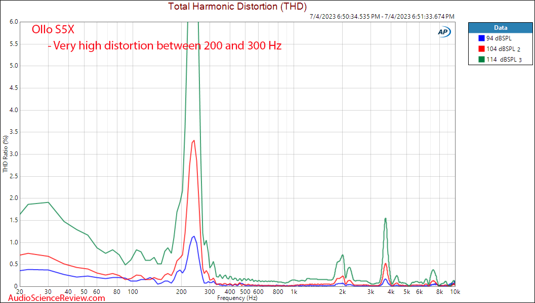
If you want the upsides of an open back, combined with deep bass extension without distortion, then this might suit you more than HD650. This is also miles better IMO than a BT990.
I see it as better in some areas than a HD650 (better subbass extension and distortion), and worse in others (less target adherence in upper mids). And the lack of this target adherence is for me a plus, not a minus, to keep in balance with the bass.
I’d judge them as equal, depending on what you need. And I am also honest about what I can and cannot hear, so that may play a part as well.
Conclusion
These are really good headphones and I’d absolutely recommend them to any pro looking for headphones, and possibly any consumer who isn’t super into bass. If you disagree with my points, that is fine, the above is all subjective opinion. I just wanted to give a different point of view.

")