Everything helps , ultimately it helps all of you as we stay independent together.In fact I started donating today through the upgrade account option. Hope it'll help.
So thanks on behalf of everyone.

Everything helps , ultimately it helps all of you as we stay independent together.In fact I started donating today through the upgrade account option. Hope it'll help.
It's the mix of sugar and fat that's irresistible for the vast majority of humans and thusly makes Amirm's point.
Maybe next time mate lol.
Maybe Harman could chip in?Everything helps , ultimately it helps all of you as we stay independent together.
So thanks on behalf of everyone.
Yes Butch ' Harmon ' could definitely chip in, he could even teach you.Maybe Harman could chip in?
Ah , we have something in common.. neither of us know what you are talking about.So I guess the "ice cream", or sugar and fat as you call it, is whatever came back from Harman's listener prefences eh?
We'll see if a little midrange "scoop" is treated as strawberry, or slightly warm bass is treated as chocolate when the reviews come out and not as rancid garbage in the ice cream. The more expensive the speaker, the less leeway for taste is what I'll predict.
All I can say is either my point is sailing clear over your head, or you're simply responding in bad faith.Yes Butch ' Harmon ' could definitely chip in, he could even teach you.
Ah , we have something in common.. neither of us know what you are talking about.
Unfortunately your obvious to this, you seem quite jolly though so I'd not worry too much.
Personally, I really like this graph type, as long as each curve has its own colour. I find the stereophile "cascade" less transparent; the geometric perspective isn't telegraphed clear enough for me.@amirm
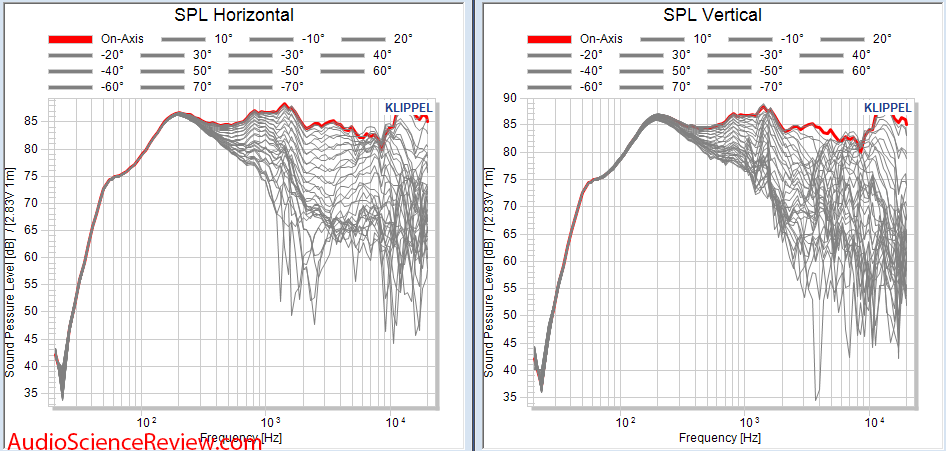
Which is not at all visually appealing, are you able to generate the data in the type of “ocean wave” graph that Stereophile/Audiolics uses?
Maybe if color coded and only one side shown unless the design is non-symmetrical (e.g. offset tweeter).Personally, I really like this graph type, as long as each curve has its own colour. I find the stereophile "cascade" less transparent; the geometric perspective isn't telegraphed clear enough for me.
Actually, this is an interesting point. People surveyed say they prefer the taste of dark/black coffee, but during taste tests the milky/light coffee consistent won by a landslide.Uh-huh.
What flavor of ice cream: chocolate vanilla, or strawberry?
Dark or milk chocolate?
If the most popular was vanilla ice cream, should we put a decapitated toy over cookies and cream’s head?
In fact I started donating today through the upgrade account option. Hope it'll help.
Actually, this is an interesting point. People surveyed say they prefer the taste of dark/black coffee, but during taste tests the milky/light coffee consistent won by a landslide.
@amirm
As pointed out by another user, how does this system deal with side/rear firing drivers?
The original Revel Salon has a rear tweeter for instance, I wonder what the Spinorama of that would be.
Also, in regards to the look of your graphs, you posted this example:
Which is not at all visually appealing, are you able to generate the data in the type of “ocean wave” graph that Stereophile/Audiolics uses?
Personally, I really like this graph type, as long as each curve has its own colour. I find the stereophile "cascade" less transparent; the geometric perspective isn't telegraphed clear enough for me.
") . 10 degrees is crowded but it works with colors.
. 10 degrees is crowded but it works with colors.Personally, I really like this graph type, as long as each curve has its own colour. I find the stereophile "cascade" less transparent; the geometric perspective isn't telegraphed clear enough for me.
Funny, I hate those. A polar map makes much more sense to my brain.
One other problem with Stereophile's is normalization to the on axis response. Amir presumably won't make that mistake.