It’s old enough to not be a “font” but simply a graphic design.GIMP has many fonts and font "packs" can be installed for even more. There's a chance it might be there.

-
WANTED: Happy members who like to discuss audio and other topics related to our interest. Desire to learn and share knowledge of science required. There are many reviews of audio hardware and expert members to help answer your questions. Click here to have your audio equipment measured for free!
You are using an out of date browser. It may not display this or other websites correctly.
You should upgrade or use an alternative browser.
You should upgrade or use an alternative browser.
What gear you wouldn't buy because of its name or cult status.
- Thread starter Liya
- Start date
Timelessness… it might be the ugliest font/logo I’ve ever seen..That is an old font from the foundation of the company decades ago way before any gangster 5th graders were born. Based on old gothic/traditional fonts. Classic timelessness is implied by using such a font. People on various forums have been trying to find out what it is for ages so they can make their own replacement glass front panels.
mhardy6647
Grand Contributor
- Joined
- Dec 12, 2019
- Messages
- 11,436
- Likes
- 24,818
True. (But) the McIntosh of old was a rather different company than the lifestyle McIntosh of today, other than the logo.That is an old font from the foundation of the company decades ago way before any gangster 5th graders were born. Based on old gothic/traditional fonts. Classic timelessness is implied by using such a font. People on various forums have been trying to find out what it is for ages so they can make their own replacement glass front panels.

McIntosh, early on, leveraged
the trope of the thrifty Scotsman -- they've left the concept of high-value products behind, a long long time ago.Aesthetically, their stuff has always been jumbled -- Mac components of the 60s, 70s and even 80s mostly looked like the product of engineers rather than designers.
So, you know 'font' dates from the 16th century (derived from the French fondre as letters were cast from molten metal, replacing materials like wood).It’s old enough to not be a “font” but simply a graphic design.
Gothic/Mediaeval fonts are more of a metal thing, not so much gangsta or hip-hop, which is Stüssy.McIntosh the logo is ugly…looks like it was drawn by a 5th grade wannabe gangster... doing graffiti/stussy lettering
Last edited:
Do not disagree, but I was just emphasizing that the logo was probably not created as a fully developed typeface.So, you know 'font' dates from the 16th century (derived from the French fondre as letters were cast from molten metal, replacing materials like wood).
mhardy6647
Grand Contributor
- Joined
- Dec 12, 2019
- Messages
- 11,436
- Likes
- 24,818
weeeeeeeeelllllll...Do not disagree, but I was just emphasizing that the logo was probably not created as a fully developed typeface.
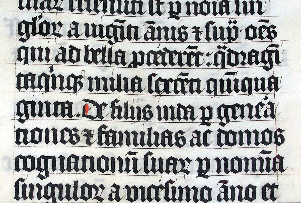
Blackletter - Wikipedia

As was pointed out earlier, this is not the exact typeface for the McIntosh logo but this style clearly influenced it.
Why is it so hard to believe that McIntosh just wanted a cool, old-style logo not a font to take to press?! The Star Wars logo did not start out as a font, either!
"cool, old-style logo..."
I must add, what was cool in 1949 is not necessarily what is cool in 2022! Here is the first graphic I can find of the logo, which changed a bit in the details in the first few years but has pretty much stayed consistent ever since.
For the record, I am a fan of classically designed Mac gear, but my beer budget doesn't facilitate champagne tastes very often!
I agree that it is ugly and it also doesn’t convey Scottishness…. more like the Third Reich. The font in the old ad above is not the same. They probably needed an actual font for the print process.Timelessness… it might be the ugliest font/logo I’ve ever seen..
I get what you mean now, yes it's possible it was drawn up by a graphic artist as a logo/logotype and didn't use a pre-existing font. The intertubes don't appear to identify a specific font either way.Do not disagree, but I was just emphasizing that the logo was probably not created as a fully developed typeface.
Last edited:
I would not purchase Topping.
Due to quality control (possible design flaws), the hoops one needs to jump through for support and repair. The lack of communications on this site and others when there are obvious product issues. Yet they (John) more than willing to chime in when they get a glowing SINAD review.
I realize all companies have products that fail, but how you deal with those failures along with customer service is what helps me determine what i purchase.
I wouldn't rush out to buy anything from PS Audio. I don't particularly like Schiit either. Wouldn't buy anything from Audioquest or Synergistic Research or any other scam audio company either. Also, Zu Audio speakers
Last edited:
- Joined
- Jan 9, 2022
- Messages
- 932
- Likes
- 1,326
It is iconic. Mc should not change it any more than Coca Cola should change theirs. We can certainly dispute the value of Mcintosh gear but their branding is ownable and envied by any other audio company. I say this as ad guy of over 25 years. Any problems Mc has have nothing to do with their logo and could be solved with gear that is in line with their pedigree.I get what you mean now, yes it's possible it was drawn up by a graphic artist as a logo/logotype and didn't use a pre-existing font. The intertubes don't appear to identify a specific font either way.
The cult status of the McIntosh brand seems to be susceptible to multiple ownership changes...

 www.prnewswire.com
Highlander Partners Announces the Acquisition of McIntosh Group, the Leader in Premium Consumer Audio Technology
/PRNewswire/ -- Highlander Partners, L.P. ("Highlander"), a leading private investment firm, today announced the acquisition of McIntosh Group, through a...
I wouldn't rush out to buy anything from PS Audio. I don't particularly like Schiit either. Wouldn't buy anything from Audioquest or Synergistic Research or any other scam audio company either.
I would not purchase Topping.
Due to quality control (possible design flaws), the hoops one needs to jump through for support and repair. The lack of communications on this site and others when there are obvious product issues. Yet they (John) more than willing to chime in when they get a glowing SINAD review.
Hmm, I own DACs from both Schiit and Topping and have had no problems from either. In fact, the "name" that most influenced those purchase decisions was ASR!
mhardy6647
Grand Contributor
- Joined
- Dec 12, 2019
- Messages
- 11,436
- Likes
- 24,818
so, this history of the Mac logo thing triggered me
Here's the earliest Mac ad I could find (Nov. 1949):

source: https://worldradiohistory.com/hd2/I...-IDX/IDX/40s/Audio-1949-Nov-OCR-Page-0058.pdf
Here's a better look, from March, 1951. Clearly business had been good enough to up their advertising budget!
Besides the size and complexity of the ad, they've moved from the back pages to the front pages of Audio magazine.

source: https://worldradiohistory.com/hd2/I...-IDX/IDX/50s/Audio-1951-Mar-OCR-Page-0006.pdf
Also: Clearly Mac wrote the book on preamplifier design 

Note the form factor of the preamp (at least, as depicted in the ad)!
source: https://worldradiohistory.com/hd2/I...-IDX/IDX/50s/Audio-1950-Feb-OCR-Page-0050.pdf
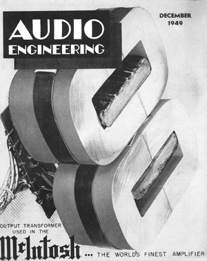
and, finally -- this was probably a fairly important publication
From Audio Dec. 1949

source: https://worldradiohistory.com/Archive-All-Audio/Archive-Audio/40s/Audio-1949-Dec.pdf
Here's the earliest Mac ad I could find (Nov. 1949):
source: https://worldradiohistory.com/hd2/I...-IDX/IDX/40s/Audio-1949-Nov-OCR-Page-0058.pdf
Here's a better look, from March, 1951. Clearly business had been good enough to up their advertising budget!
Besides the size and complexity of the ad, they've moved from the back pages to the front pages of Audio magazine.
source: https://worldradiohistory.com/hd2/I...-IDX/IDX/50s/Audio-1951-Mar-OCR-Page-0006.pdf
Also: Clearly Mac wrote the book on preamplifier design
Note the form factor of the preamp (at least, as depicted in the ad)!
source: https://worldradiohistory.com/hd2/I...-IDX/IDX/50s/Audio-1950-Feb-OCR-Page-0050.pdf
and, finally -- this was probably a fairly important publication
From Audio Dec. 1949
source: https://worldradiohistory.com/Archive-All-Audio/Archive-Audio/40s/Audio-1949-Dec.pdf
One of the best movies of the 1970's, the true golden age of US cinema.Props for the screenshot from one of the best and most underrated films of all time! Pauline Karl declared it one of the best films of its kind ever made, and she was spot on. Philip Kaufman rocks.
Damn, I miss Audio magazine.so, this history of the Mac logo thing triggered me
Here's the earliest Mac ad I could find (Nov. 1949):
View attachment 214015
source: https://worldradiohistory.com/hd2/I...-IDX/IDX/40s/Audio-1949-Nov-OCR-Page-0058.pdf
Here's a better look, from March, 1951. Clearly business had been good enough to up their advertising budget!
Besides the size and complexity of the ad, they've moved from the back pages to the front pages of Audio magazine.
View attachment 214016
source: https://worldradiohistory.com/hd2/I...-IDX/IDX/50s/Audio-1951-Mar-OCR-Page-0006.pdf
Also: Clearly Mac wrote the book on preamplifier design
View attachment 214017
Note the form factor of the preamp (at least, as depicted in the ad)!
source: https://worldradiohistory.com/hd2/I...-IDX/IDX/50s/Audio-1950-Feb-OCR-Page-0050.pdf
and, finally -- this was probably a fairly important publication
From Audio Dec. 1949
View attachment 214018
source: https://worldradiohistory.com/Archive-All-Audio/Archive-Audio/40s/Audio-1949-Dec.pdf
Rip City Dave
Active Member
Fiat, Alfa Romeo, Ferrari, for that matter most anything Stellantis, Land Rover....
Similar threads
- Replies
- 69
- Views
- 5K
- Replies
- 10
- Views
- 984
- Replies
- 18
- Views
- 854
- Replies
- 169
- Views
- 10K