
- Joined
- Jun 19, 2018
- Messages
- 6,652
- Likes
- 9,406
I don't know how to interpret such a graph.
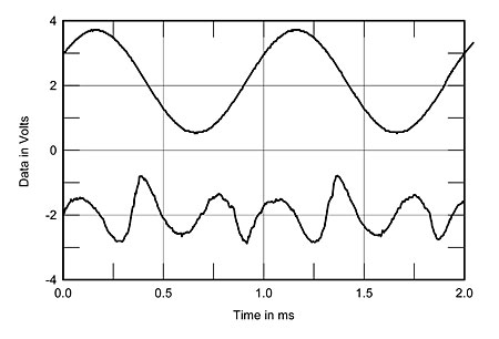
Here is another one they did, very different, for a AB class integrated:
I would also like to understand better how useful this graph is TBH. Perhaps someone with more technical knowledge of amplifiers can chime in.
What I do understand is this: where you see peaks in distortion (lower trace) around the zero-crossing points of the fundamental waveform (upper trace), this implies that the amplifier produces crossover distortion, which is a form of distortion whose level is inversely related to level of the fundamental.
Since auditory masking becomes more effective as level increases, distortion that increases in level as the level of the fundamental decreases (as is the case with crossover distortion) will be more audible than distortion that increases in level as the the level of the fundamental also increases (e.g. clipping distortion).
If you look at the graph of the Mark Levinson I posted, you see that the distortion primarily occurs at/around the zero-crossing point. This is not the case in the graph you posted. If the distortion in either graph is audible, it is more likely to be audible in the case of the Mark Levinson.
What I'm less sure about is how necessary it is to look at a graph like this, given we already have a THD/IMD+N vs power/voltage graph. It depends, I think, on whether the rise in THD/IMD+N as voltage decreases is attributable primarily to noise or distortion. If the rise is attributable to noise, any such crossover distortion is likely to be inaudible (buried under the noise). But IIUC, a THD/IMD+N vs power/voltage graph will not show this, hence the (possible) utility of this additional measurement showing only the distortion waveform relative to the fundamental.
It's a topic I'd like to find out more about, too
")
