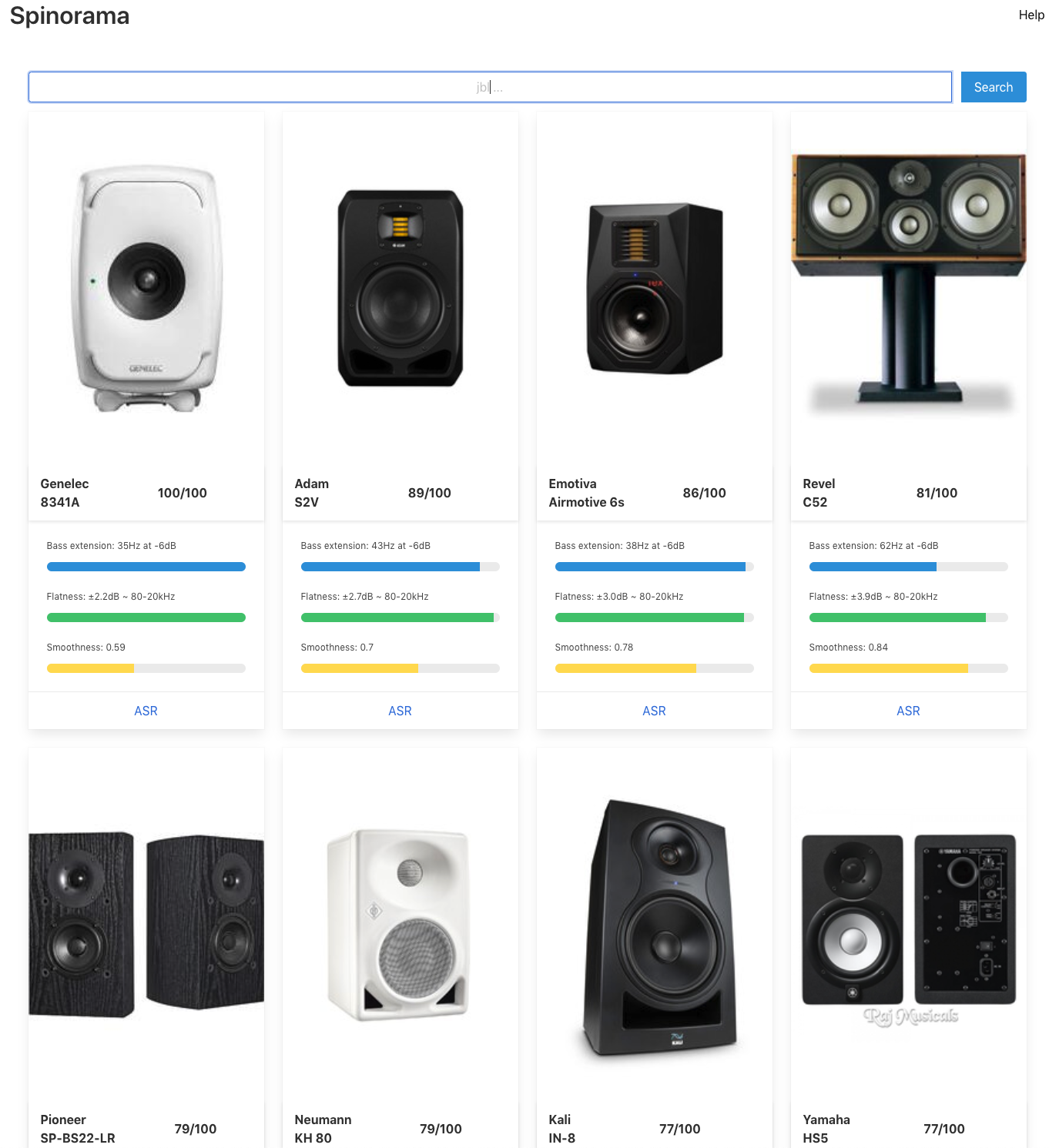
I had some time to kill in a plane and I played with all the data’s that Amir gives us.
you can see them on www.spinorama.org The code to generate them is On github Too.
just click on a graph to drill down, the last one is slightly interactive.
better contour plot and polar plot are under debugging. I will add a view to compare 2 speakers side by side.
if you like python notebook, you can easily play with the graphs yourself.
pull request welcome on github and please give me some feedback,
it is easy to improve.
Last edited: