-
WANTED: Happy members who like to discuss audio and other topics related to our interest. Desire to learn and share knowledge of science required. There are many reviews of audio hardware and expert members to help answer your questions. Click here to have your audio equipment measured for free!
You are using an out of date browser. It may not display this or other websites correctly.
You should upgrade or use an alternative browser.
You should upgrade or use an alternative browser.
What happened to the dark theme?
- Thread starter voodooless
- Start date
MakeMineVinyl
Major Contributor
Its still there for me. Maybe its just so dark you can't see it?
- Thread Starter
- #3
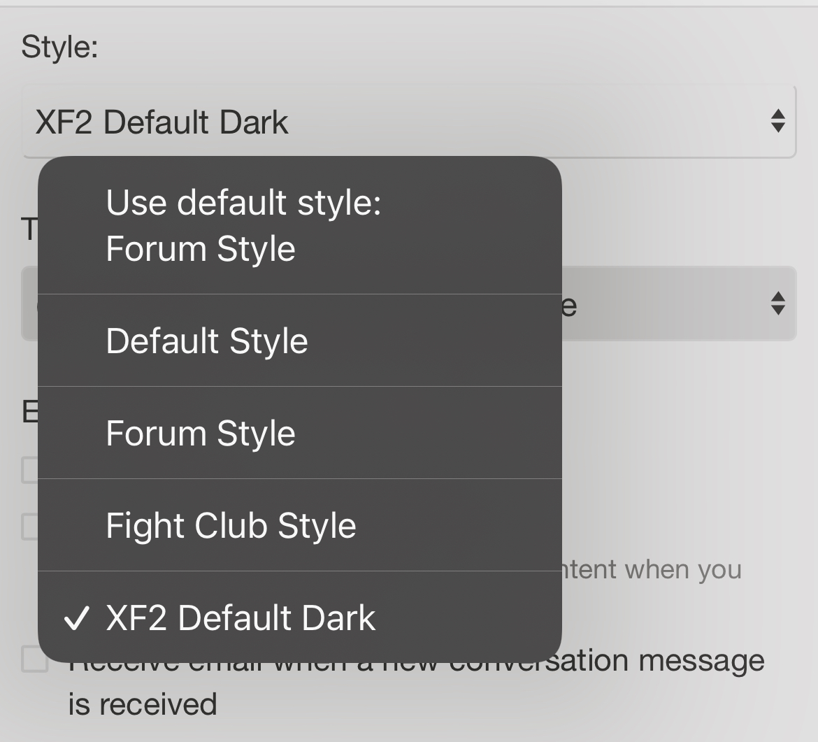
Yes, it’s there:

But it ain’t dark anymore… not for me at least…
But it ain’t dark anymore… not for me at least…
MakeMineVinyl
Major Contributor
Its dark for me. Actually dark gray. Maybe dark slate. Maybe with a tinge of magenta.
- Thread Starter
- #5
Hmm, the plot thickens.. if I disable “night mode” in my browser (Brave iOS), I get the usual dark colors back. I’ve never seen that before  Didn’t touch the setting either. Also the feature has been there for about a month… anyway, it seems to do exactly the opposite from what it should do.
Last edited:
- Thread Starter
- #7
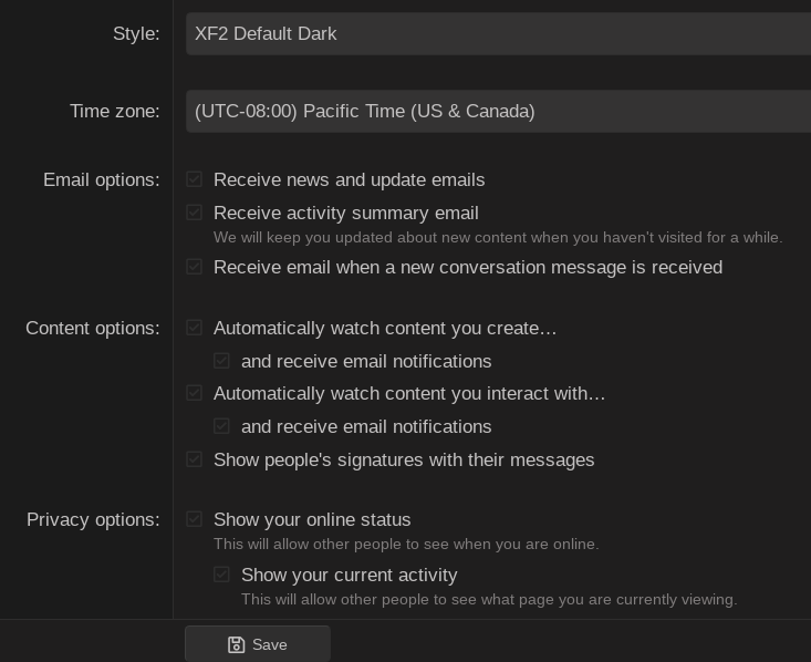
Like I said above, looks like it’s a browser feature (or rather, a bug).Just checked the various settings and they work for me. Did you try XF2 Deafult Dark?
Was going to start a therad, Thankfully this popped up.
The Dark mode has some isues. THis one HERE:
 You can't see the boxes.
This gray font does not pop and have enough contrast.
I've been using FIght Club. Easy to read works well. But the dark theme could take some improvements. Not a big deal. Bit something I noticed.
I actually prefer a white text over black with some Red used as it gives a very sharp and clear defined layout.
The Dark mode has some isues. THis one HERE:
This gray font does not pop and have enough contrast.
I've been using FIght Club. Easy to read works well. But the dark theme could take some improvements. Not a big deal. Bit something I noticed.
I actually prefer a white text over black with some Red used as it gives a very sharp and clear defined layout.
I can change the text color but isn't it supposed to be easy on the eye in "dark" mode?
JSmith
Master Contributor
That's the theory... personally dark themes really screw with my eyes. Maybe I need to see an optometrist...isn't it supposed to be easy on the eye in "dark" mode?

No issues here though Win/Chrome on PC when selecting dark mode.
JSmith
Propheticus
Senior Member

Dark Mode Can Improve Text Readability — But Not for Everyone
Dark mode themes and interfaces are growing in popularity, but they're not automatically more accessible, brought to you by the Bureau of Internet Accessibility.
Dark modes may not provide enough contrast
Inverting a color scheme won’t necessarily yield high contrast. The Web Content Accessibility Guidelines (WCAG) requires content to meet a minimum color contrast ratio of at least 4.5:1 for normal text, with exceptions for large text, incidental (or decorative) text, and logotypes. To meet Level AAA conformance, content must maintain a 7:1 contrast for normal text.
Dark modes have numerous benefits for certain users:
Put simply, dark modes are popular for a reason: For many people, these themes provide a more pleasant experience. Dark backgrounds may reduce eye strain, and some users simply prefer the aesthetic. When developers pay attention to contrast ratios, dark modes can improve accessibility.
- If a screen has flicker problems, dark backgrounds can reduce flickering.
- Dark themes are less likely to trigger photophobia (sensitivity to light).
- Light-colored text on a dark background can be easier to read for a long period of time.
- Dark themes can make screens easier to use in low-light conditions.
A handy contrast checker linked on that page: https://color.a11y.com/
Propheticus
Senior Member
personally dark themes really screw with my eyes. Maybe I need to see an optometrist...
"dark backgrounds can cause a "halation effect" for users with astigmatism. Darker displays cause the iris to open to receive more light. For people with astigmatism, this can make focusing more difficult."
People into photography will know this effect as softer images due to aberration on larger apertures and a shallower depth of field.
Propheticus
Senior Member
Had to trick the page to use the dark theme by using the redirect URL you get when making the style selectionA handy contrast checker linked on that page: https://color.a11y.com/
https://www.audiosciencereview.com/forum/index.php?misc/style&style_id=4&_xfRedirect=https%3A%2F%2Fwww.audiosciencereview.com%2Fforum%2Findex.php%3Fthreads%2Fsabaj-a10d-2022-version-review-dac-amp.34918%2Fpage-4&t=1655203807%2C7ae8b8ff81b36e825caca0a9e70f1527Overall looks okay, with a few possible improvements. Two I think worth looking at:
- The "Click to expand" text on long quotes is really unreadable. Contrast 1.41:1
- The second line (Thread OP, date, subforum) and some bits of other text in the "Similar threads" are low-ish in contrast
The same counts for the thread info by-lines on the forum and subforum pages.
Last edited:
Andysu
Major Contributor
- Joined
- Dec 7, 2019
- Messages
- 2,946
- Likes
- 1,540
The Dark Side of the Forum is a pathway to many abilities some consider to be unnatural.Had to trick the page to use the dark theme by using the redirect URL you get when making the style selection
https://www.audiosciencereview.com/forum/index.php?misc/style&style_id=4&_xfRedirect=https%3A%2F%2Fwww.audiosciencereview.com%2Fforum%2Findex.php%3Fthreads%2Fsabaj-a10d-2022-version-review-dac-amp.34918%2Fpage-4&t=1655203807%2C7ae8b8ff81b36e825caca0a9e70f1527
Overall looks okay, with a few possible improvements. Two I think worth looking at:
- The "Click to expand" text on long quotes is really unreadable. Contrast 1.41:1
View attachment 212690- The second line (Thread OP, date, subforum) and some bits of other text in the "Similar threads" are low-ish in contrast
The same counts for the thread info by-lines on the forum and subforum pages.
View attachment 212691
its possible to learn this headless black panther power ?
not from a regular member .
Similar threads
- Replies
- 0
- Views
- 343
- Replies
- 2
- Views
- 2K
- Replies
- 2
- Views
- 281
- Replies
- 16
- Views
- 920
