You can compare that to close to ideal timing of Neumann KH150:
KH150 post #786
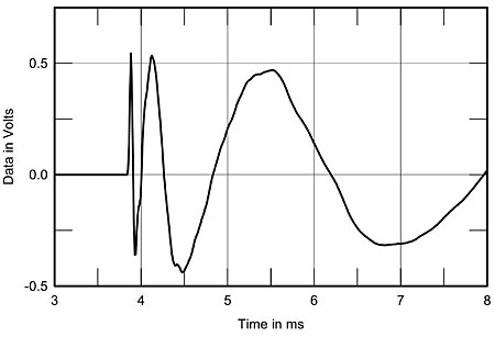
Again, by my education I know how to set-up graphs to represent data. What I see here is irritating to say the least. The 'impulse' response, or deviation thereof, cannot be understood by the human vision. It is the same as with QR codes:
click me
What does it say? A lot, but not to Your eyes. It needs machinery, and so does the interpretation of an impulse response.
What is seen easily with the infamous 'impuls' is the deviation from an "ideal". So audiophools are easily tricked into thinking (?) that there is deviation, hence there is signal degradation. That IS true, yes, the
signal is degraded. But that says nothing in regard to the
information that the human hearing receives.
As I stated earlier, all the information is there as far it is relevant for the hearing, let alone the enjoyment of music, or even the information contained in reproduced human talk ... . It is just the amplitude spectrum over subsequent periods of time. Vulgo, the frequency response, amplitude, not phase.
The sad fact that even educated reviewers print 'impulse' graphs, and to double up the 'step' response too, doesn't mean it makes any sense at all. I personally think it is some b/s nobody ever thought about. Because the overly prudent engineers of the software used brought that in to just show off. Shi* happens ... , forgiven, but it remains shi*.

")