HarmonicTHD
Major Contributor
- Joined
- Mar 18, 2022
- Messages
- 3,326
- Likes
- 4,835
First. There is some sort of an unwritten quasi standard for these graphs.View attachment 258943
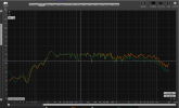
legend - orange is 60cm from wall, blue is against the wall.
what am I paying attention to ? thank you
At the upper right there is a tool in REW which lets you set the graph axis.
Set x from 20 to 20000Hz so we see the whole audio spectrum.
Set y from 50 to 100dB this makes it easier for those who look at these type of graphs often and that’s how many here are displayed.
(I know DallasSteve told you differently but if you could capture the legend below too, that would be great as it not only shows the color but also the smoothing type used, which makes a big difference in the graphs appearance. Again either use Var or 1/12 for smoothing).
")