Probably because on the whole they have dreadful usability. Living in Denmark I have encountered plenty of B&O gear through the years and I never cease to be amazed how singularly nonintuitive their stuff is. All style over substance. Some of their speakers were very good though.I am surprised nobody has mentioned Bang & Olufsen yet.

-
WANTED: Happy members who like to discuss audio and other topics related to our interest. Desire to learn and share knowledge of science required. There are many reviews of audio hardware and expert members to help answer your questions. Click here to have your audio equipment measured for free!
You are using an out of date browser. It may not display this or other websites correctly.
You should upgrade or use an alternative browser.
You should upgrade or use an alternative browser.
Examples of good usability in hi-fi equipment
- Thread starter tomchris
- Start date
restorer-john
Grand Contributor
Gotta agree. I've picked up all sorts of B&O over the decades and sold it all on. Absolutely lovely to look at, but usability is non-existent. Connections and cabling was horrible, basically unreadable controls on remotes and units, average performance and not fantastic reliability.Probably because on the whole they have dreadful usability. Living in Denmark I have encountered plenty of B&O gear through the years and I never cease to be amazed how singularly nonintuitive their stuff is. All style over substance. Some of their speakers were very good though.
I must admit though, their Series 5000 system from the mid 1980s was amazing with a bi-directional remote (master control panel)- that was, until the batteries leaked in it and totally destroyed the board...
D
Deleted member 48726
Guest
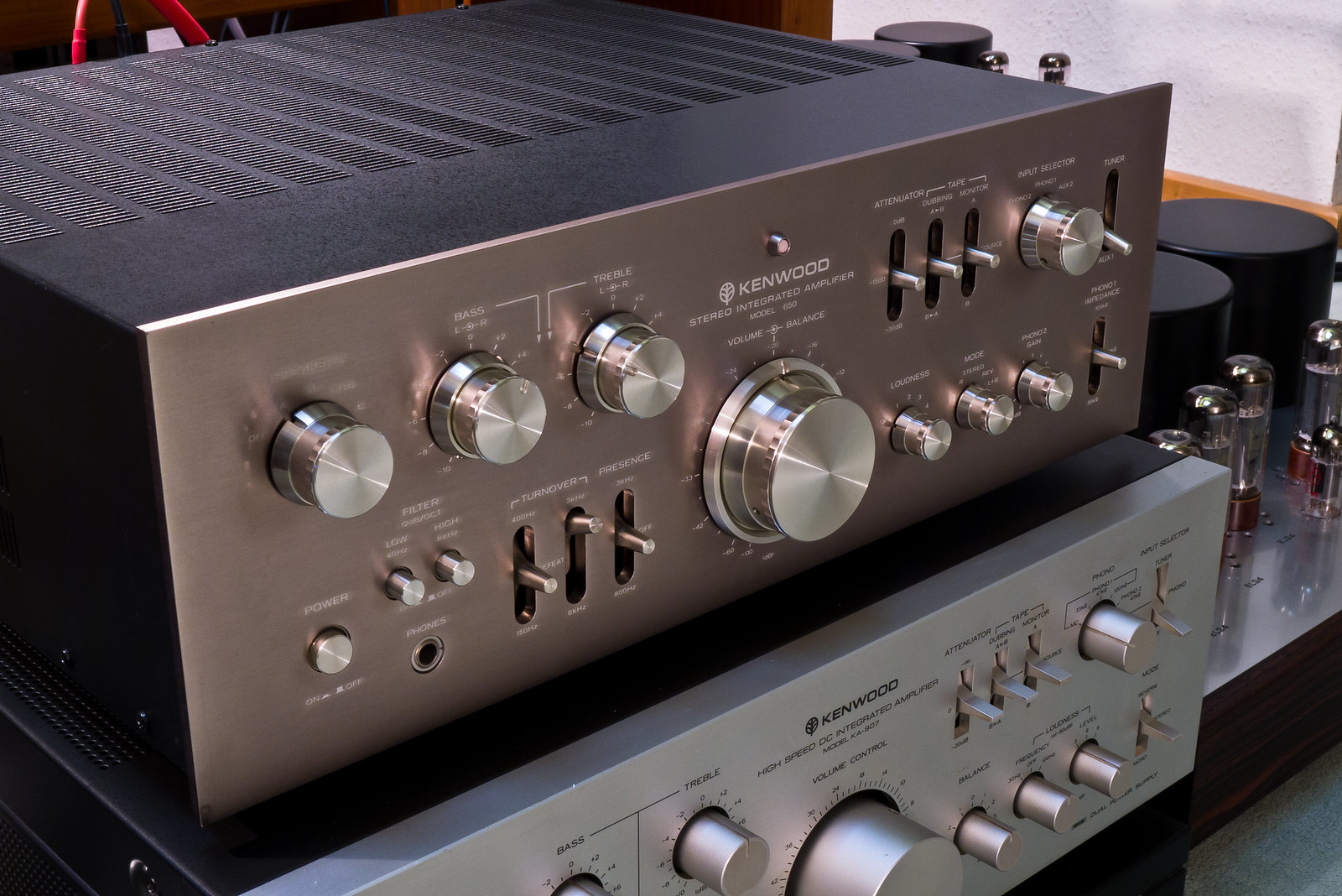
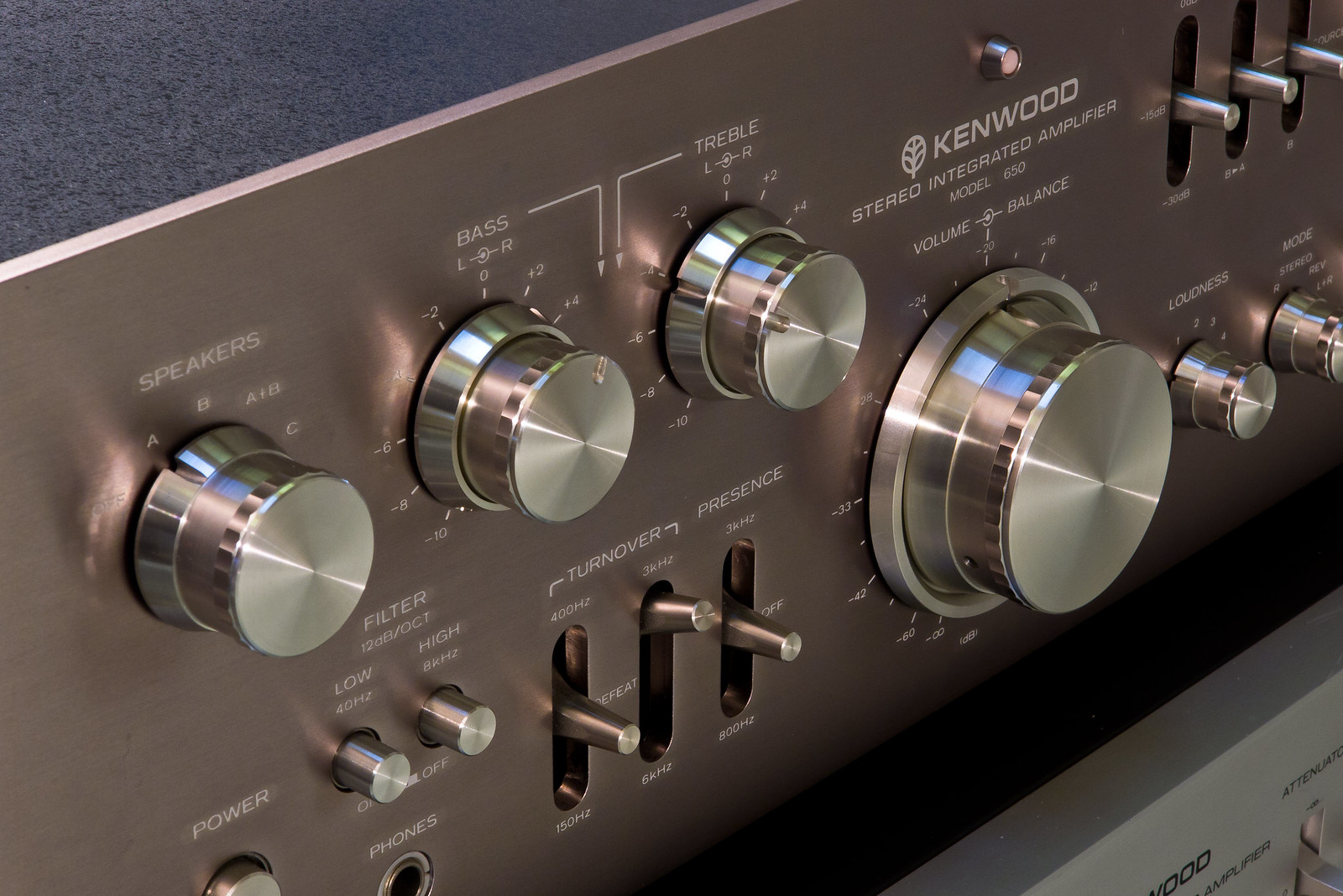
Kenwood Supreme series 650 (1975-79):
Kenwood KA-907(1979-80) notice the fine knurling of the knobs:
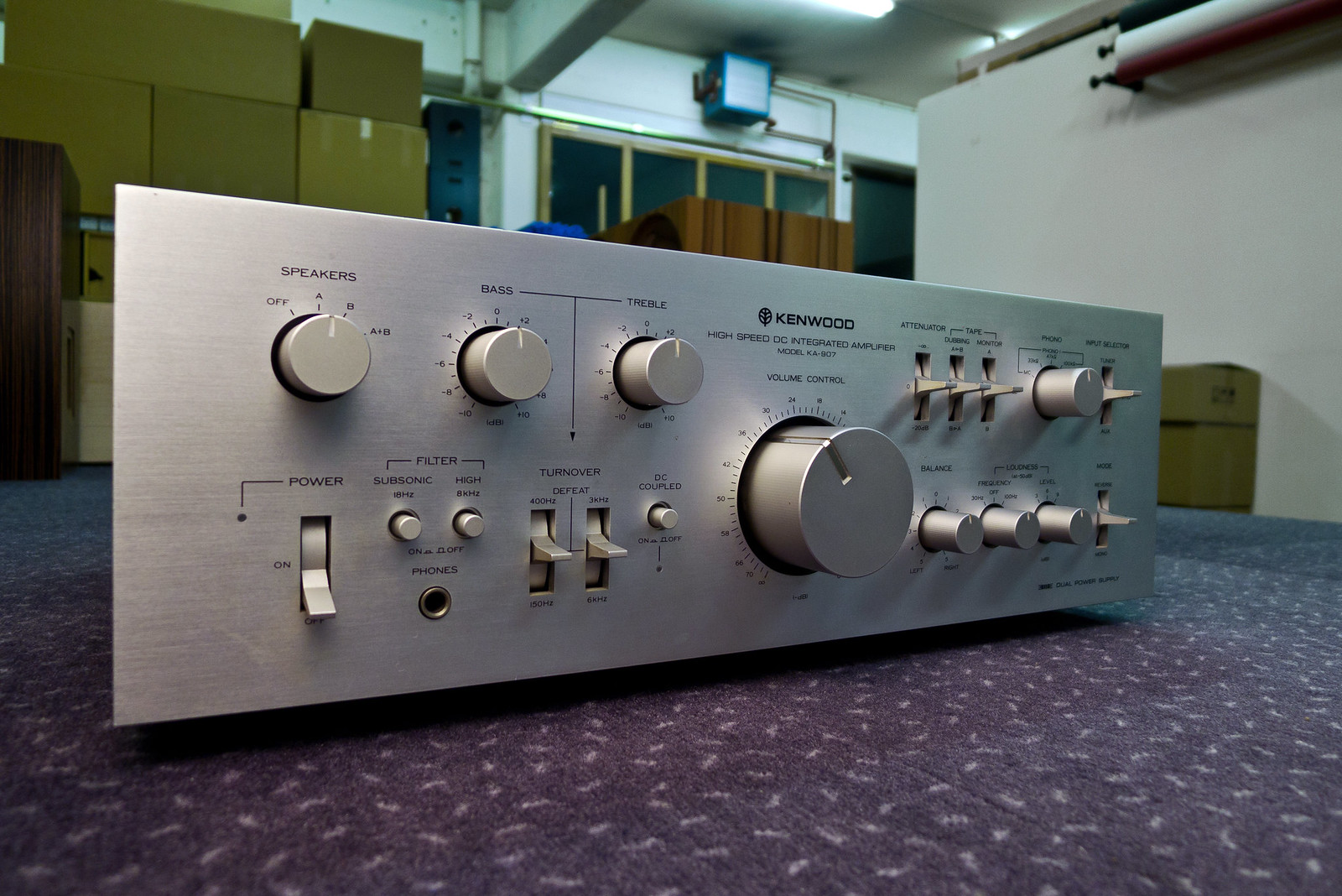
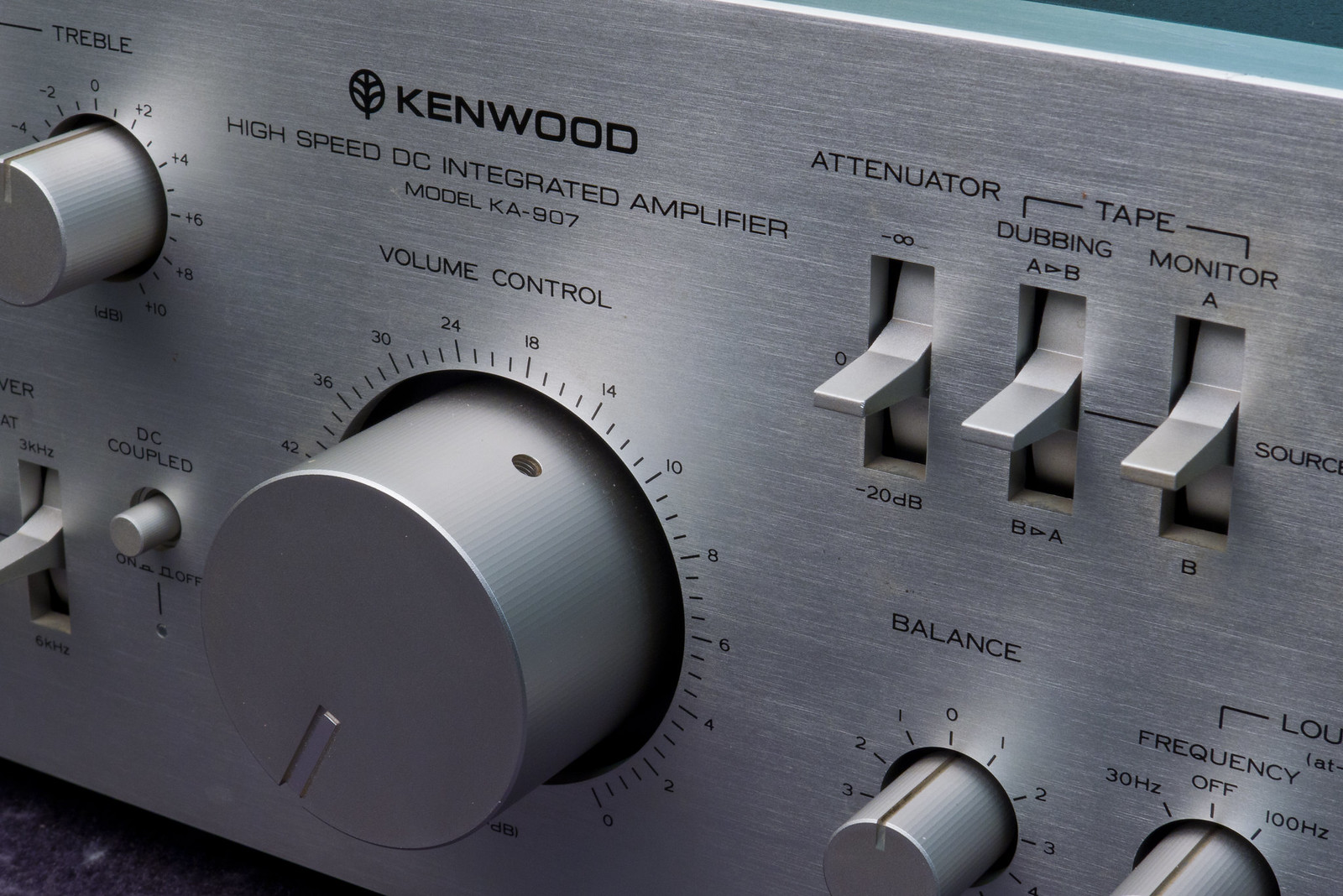
But what in the world is "High Speed Integrated Amplfier" ??

D
Deleted member 48726
Guest
Looks nice, but I absolutely despise touch control on remotes and in vehicles. You have to look every time and it's just a case of that it is made because they can, not because it's better.Bang & Olufsen Beolink 7000, adaptive capacitive touch functions, two-way remote control:

When the Beomaster 4000 was working, it was a nice integrated amp. Literally NO ONE one wants to repair it, though. I opened it up once, and I understand why. I do like the control sliders. I used it for awhile down at the office as the world's largest headphone amp just for the looks. I have had better luck with the 1700 turntable, it's still going strong, but when the cartridges are worn out, I may sell it off...$250 for the SoundSmith standard elliptical is a hard pill to swallow.Gotta agree. I've picked up all sorts of B&O over the decades and sold it all on. Absolutely lovely to look at, but usability is non-existent. Connections and cabling was horrible, basically unreadable controls on remotes and units, average performance and not fantastic reliability.
I must admit though, their Series 5000 system from the mid 1980s was amazing with a bi-directional remote (master control panel)- that was, until the batteries leaked in it and totally destroyed the board...
- Joined
- Jan 27, 2019
- Messages
- 7,281
- Likes
- 12,186
Geek out! If you went shopping in this store. How much would you spend on here?
Interesting warehouse. But to your question: I wouldn't spend a cent. Not a thing there appeals to me and if someone gave me an item from there I'd look to give it away
I understand all that old stuff appeals to other geeks. (I'm definitely not a "tons of knobs" guy).
Old Listener
Senior Member
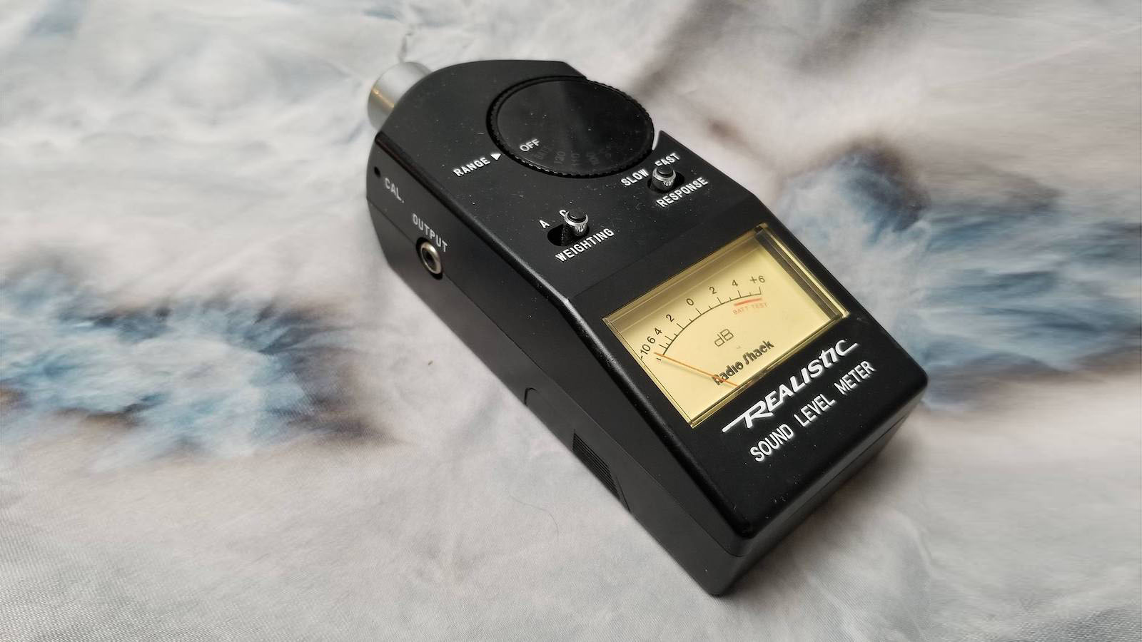
I still have one and use it to check audio level.Before the days of smart phones, automated DRC, and all the rest, this super handy
little guy has been making measurements and balancing systems here since the 1980s.
It still works perfectly and I find myself reaching for it now and then for a quick eq.
I always wondered who the marketing idiot was that named a lot of there stuff "Realistic"?
That just sucked. LOL
it mostly a load of old tat that's true.Interesting warehouse. But to your question: I wouldn't spend a cent. Not a thing there appeals to me and if someone gave me an item from there I'd look to give it away
I understand all that old stuff appeals to other geeks. (I'm definitely not a "tons of knobs" guy).
Would I like to spend hours looking around it? Yes. Yes I would.
UI is such an individual thing. Growing up using MS-DOS and becoming accustomed to its file management protocols, I find iOS to be impenetrably opaque. Obviously not many people agree with me.It's interesting what different people can "bump on" in terms of user interface.
I got the Bluesound Node a while back and loved how it really was plug and play. But it has a few quirks, one of which is driving me mad: when you have a list of tracks and select one to play, no indicator pops up beside that track to show which one is playing! Literally every single other music app I've ever used has had some sort of "playing now" icon or bouncing meter or something beside the playing track, so when you are scanning the list you can instantly see it and for instance select the next track if you are sampling. This is such a strange oversight that is a continual bit of friction during use, it's actually pushing me to finally trying Roon.
I know this is a little off topic but I hate touch screens in car dashboards and much prefer rotary 3D knobs. I live where there are narrow and twisty roads and need to keep my eyes on them. In my chair like Roon, BluOS and Qobuz on my tablet and keeping my ears pointed at my speakers.
Agreed 100% and I read an Automotive News article recently that said a majority of drivers agree and they are designing retro style knobs versus the touch screen stuff. I will try to find the article and link it here later.I know this is a little off topic but I hate touch screens in car dashboards and much prefer rotary 3D knobs. I live where there are narrow and twisty roads and need to keep my eyes on them. In my chair like Roon, BluOS and Qobuz on my tablet and keeping my ears pointed at my speakers.
On Edit adding links:
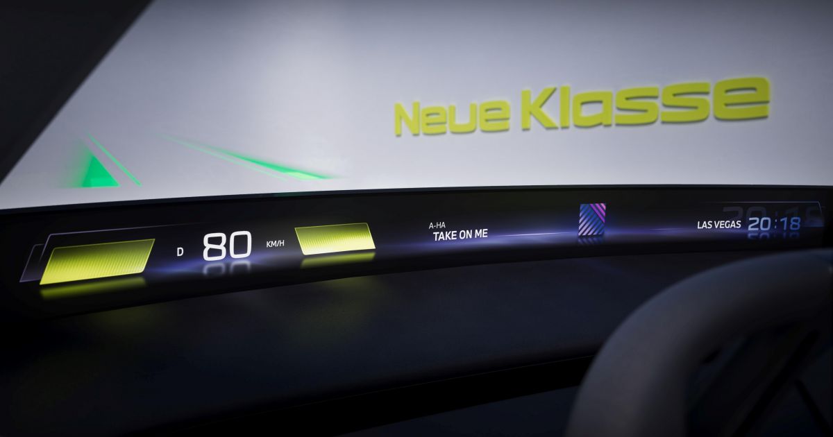
BMW to banish big, distracting interior screens?
BMW chairman Oliver Zipse said 'driver distraction is the main source of accidents, not fast driving' as he revealed a minimalist concept car.

Opinion: Touchscreens in cars are a menace | Hagerty UK
Putting a touchscreen in a car is a bad idea, argues James Mills. Swedish magazine Vi Bilägare has highlighted their hidden dangers.
 www.hagerty.co.uk

Enthusiasts are right, touchscreens aren’t nearly as good as traditional physical controls and a new study proves it
A new study proves that touchscreens are bad for car safety and aren't as safe as traditional physical controls in a car.
Last edited:
mhardy6647
Grand Contributor
- Joined
- Dec 12, 2019
- Messages
- 11,368
- Likes
- 24,574
Their turntables aren't (weren't) bad at all, actually, in terms of ergonomics, as long as one is willing to accept that the deck will do the mechanical work, not the human operator.Probably because on the whole they have dreadful usability. Living in Denmark I have encountered plenty of B&O gear through the years and I never cease to be amazed how singularly nonintuitive their stuff is. All style over substance. Some of their speakers were very good though.

I find my TX-2 quite easy to use.
Their tape decks were OK as well.
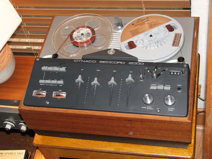
David Hafler (Dynaco) sold this b&o reel to reel deck in the US in the '60s.

The beocenter 1900 was easy enough to use, too, once set up.

EDIT: In fairness, I don't know about the tape decks, but the receivers (and the tts) were, at best, tedious to service. The receivers also didn't age very gracefully. The tts have held up a bit better, but, again, not fun to do even routine maintenance (other than cartridge replacement -- the styli were nonreplaceable, at least the generation of cartridges and arms of the TX-2 era).
- Joined
- Feb 23, 2016
- Messages
- 20,690
- Likes
- 37,415
Glad to see they are listening. I don't think I've ever seen anyone prefer touchscreens. Some think they are alright, and say they understand why they are used, but no one in my memory has said they prefer them to physical controls. For some other purposes they are fine or even preferable, but as controls in a vehicle where your attention by definition needs to mostly be elsewhere it has bothered me companies pushed so much onto cars despite no one wanting them.Agreed 100% and I read an Automotive News article recently that said a majority of drivers agree and they are designing retro style knobs versus the touch screen stuff. I will try to find the article and link it here later.
On Edit adding links:
BMW to banish big, distracting interior screens?
BMW chairman Oliver Zipse said 'driver distraction is the main source of accidents, not fast driving' as he revealed a minimalist concept car.www.carexpert.com.au
Opinion: Touchscreens in cars are a menace | Hagerty UK
Putting a touchscreen in a car is a bad idea, argues James Mills. Swedish magazine Vi Bilägare has highlighted their hidden dangers.
Enthusiasts are right, touchscreens aren’t nearly as good as traditional physical controls and a new study proves it
A new study proves that touchscreens are bad for car safety and aren't as safe as traditional physical controls in a car.www.themanual.com
Like some, hate some, mixed feelings and do not understand and to this one I say why Y why

I hate the trend to minimalism in general. I don't like how it looks, I don't like it in use.
Here are my ten demands. Manufacturers, please take careful notes. I will not stay on the line long enough for you to trace the call.
1) I want meters. Analogue or digital it's all the same to me. And no cheating by using an LED screen with cartoon meters.
2) I want a switch or a button for everything. Even things I'm never going to use. No screens, no menus. The switches and buttons should look and feel like they were designed to last a thousand years, and they should light up when you press them - or have little LEDs embedded in them that light up. Sony could do that decades ago, so catch up.
3) The volume control shall be a large, rotary, stepped attenuator with dB marking. Turning it should feel like you are turning the combination dial on the master safe in a Geneva bank.
4) I want grab handles
5) I want rack-mount ears
6) I want insane build quality. Military grade. If I tell someone I got it out of the command bunker at a nuclear missile silo they should not express any surprise.
7) No blue LEDS. They look tacky and dazzle in low lighting conditions. The correct LED colours are - red or orange for power, green and yellow for other functions. This is basic stuff.
8) Try to put the AC power socket as far away from the signal cable sockets as possible. Not right next to them. There's an easy one for you to get you started.
9) No two-tone colour schemes. Hi-fi colours are black, silver or champagne. No flowery font and especially no slogans on the fascia. Just label every function clearly and cleanly. The manufacturer name can be displayed but only at either top right, top left or bottom centre - and in a way that looks like you don't have to try.
10) No sappy names. Alpha numeric designations only. This is a man's game now.
Who's with me?
- Joined
- Jan 27, 2019
- Messages
- 7,281
- Likes
- 12,186
I hate touchscreens -- and I particularly hate "typing" on my $?#&!ing "smartphone".

OMG, how I feel this! The sheer enmity between me and touchscreen technology that builds up when I try to type much of anything on my phone...
I wouldn't be surprise to find out that it was struggling to text Darth Sidious that finally pushed Anakin Skywalker to the dark side and sent him in to a younglings-slaughtering rage.
- Joined
- Feb 23, 2016
- Messages
- 20,690
- Likes
- 37,415
You guys typing on a smartphone, learn to swype. I can swype very nearly as fast as I can type and I can type reasonably fast. It does now and again have errors not due to me, but it is much better than poking at a keyboard for typing on a touchscreen. Of course if you want it right simply get a bluetooth keyboard connected to the phone. Okay from home at least.
- Joined
- Feb 23, 2016
- Messages
- 20,690
- Likes
- 37,415
I don't know, I thought Pioneer won on knob and switch count in those same years.Well -- I appreciate your candor. Thanks for sharing!
With you? Umm... nope, not generally.
You want some switches, knobs, and buttons, though? That I could help you with!

It wasn't widely reported at the time, but Superscope (owners of the "marantz" brand name in those days) practically exhausted the world's remaining natural resources of knobs and buttons in the mid-1970s. Only a quick release of supplies from the United States' Strategic Knob Reserve averted a catastrophe of global proportions.
- Joined
- Jan 27, 2019
- Messages
- 7,281
- Likes
- 12,186
Since you asked...
I don't like usability sacrificed to minimalism. But I do want as much minimized as possible. I like sleek, unfussy, uncomplicated looking gear for the most part.
(Especially stuff I have to interact with - DACs, Preamps etc).
I've never felt the need for a meter on any audio equipment I've owned. Don't even know why I'd want or need one.
I agree generally speaking a switch is better than a screen. However some devices are complicated enough that it would mean too many switches/buttons for my taste, and a multi-function touch screen can make it nicer looking and more usable. I think my Benchmark LA4 does a pretty decent job with a touchscreen. It makes for instance the input selections more customizable which in itself helps some ergonomics.
I prefer a knob that turns in a silky smooth fashion, not too clicky.
Gawd no! Nothing turns me off more in consumer equipment than attempts to make it look like pro equipment. Pro equipment for me is generally unsightly.
See above. Yeeeeuuuuck!
Give me a nice, sleek, contemporary look, please. It'll sit in my rack just fine without being bolted in.
Thumbs up for great build quality. But not "military/pro-looking." Nothing that looks like it might fit in well with a submarine.
No particular taste there, with one exception: No red. Generally red has a psychological association with "danger cues" and frankly I find a constant red light to be a bit unnerving. I prefer more calming colors.
Ok!
If I have any vow it's to never buy another bloody black component again! First...that color is boring as hell, makes all the equipment tend to look undistinguished, sometimes indistinguishable, and it makes it harder for these aging eyes to use. Tiny black buttons and black knobs on a black faceplate? Ugh!
(It's the only thing I'm a bit unhappy about with my Benchmark preamp). I'm fine with a two-tone approach or mixing materials. For instance I don't mind the "pop" that comes with a classy brass volume knob or controls on a dark faceplate.
Ugh. While I'm not looking for overly goofy or pretentious names for equipment, the only thing worse is "equipment-turned-in-to-math." That is just using faceless sets of letters or numbers. "Wait...WTF is a 10.4C...again?"
Some agreement, but major divergence.
I hate the trend to minimalism in general. I don't like how it looks, I don't like it in use.
I don't like usability sacrificed to minimalism. But I do want as much minimized as possible. I like sleek, unfussy, uncomplicated looking gear for the most part.
(Especially stuff I have to interact with - DACs, Preamps etc).
Here are my ten demands. Manufacturers, please take careful notes. I will not stay on the line long enough for you to trace the call.
1) I want meters. Analogue or digital it's all the same to me. And no cheating by using an LED screen with cartoon meters.
I've never felt the need for a meter on any audio equipment I've owned. Don't even know why I'd want or need one.
2) I want a switch or a button for everything. Even things I'm never going to use. No screens, no menus. The switches and buttons should look and feel like they were designed to last a thousand years, and they should light up when you press them - or have little LEDs embedded in them that light up. Sony could do that decades ago, so catch up.
I agree generally speaking a switch is better than a screen. However some devices are complicated enough that it would mean too many switches/buttons for my taste, and a multi-function touch screen can make it nicer looking and more usable. I think my Benchmark LA4 does a pretty decent job with a touchscreen. It makes for instance the input selections more customizable which in itself helps some ergonomics.
3) The volume control shall be a large, rotary, stepped attenuator with dB marking. Turning it should feel like you are turning the combination dial on the master safe in a Geneva bank.
I prefer a knob that turns in a silky smooth fashion, not too clicky.
4) I want grab handles
Gawd no! Nothing turns me off more in consumer equipment than attempts to make it look like pro equipment. Pro equipment for me is generally unsightly.
5) I want rack-mount ears
See above. Yeeeeuuuuck!
Give me a nice, sleek, contemporary look, please. It'll sit in my rack just fine without being bolted in.
6) I want insane build quality. Military grade. If I tell someone I got it out of the command bunker at a nuclear missile silo they should not express any surprise.
Thumbs up for great build quality. But not "military/pro-looking." Nothing that looks like it might fit in well with a submarine.
7) No blue LEDS. They look tacky and dazzle in low lighting conditions. The correct LED colours are - red or orange for power, green and yellow for other functions. This is basic stuff.
No particular taste there, with one exception: No red. Generally red has a psychological association with "danger cues" and frankly I find a constant red light to be a bit unnerving. I prefer more calming colors.
8) Try to put the AC power socket as far away from the signal cable sockets as possible. Not right next to them. There's an easy one for you to get you started.
Ok!
9) No two-tone colour schemes. Hi-fi colours are black, silver or champagne. No flowery font and especially no slogans on the fascia. Just label every function clearly and cleanly. The manufacturer name can be displayed but only at either top right, top left or bottom centre - and in a way that looks like you don't have to try.
If I have any vow it's to never buy another bloody black component again! First...that color is boring as hell, makes all the equipment tend to look undistinguished, sometimes indistinguishable, and it makes it harder for these aging eyes to use. Tiny black buttons and black knobs on a black faceplate? Ugh!
(It's the only thing I'm a bit unhappy about with my Benchmark preamp). I'm fine with a two-tone approach or mixing materials. For instance I don't mind the "pop" that comes with a classy brass volume knob or controls on a dark faceplate.
10) No sappy names. Alpha numeric designations only. This is a man's game now.
Ugh. While I'm not looking for overly goofy or pretentious names for equipment, the only thing worse is "equipment-turned-in-to-math." That is just using faceless sets of letters or numbers. "Wait...WTF is a 10.4C...again?"
Who's with me?
Some agreement, but major divergence.
Similar threads
- Replies
- 11
- Views
- 829
- Replies
- 83
- Views
- 5K
- Replies
- 95
- Views
- 8K
- Replies
- 9
- Views
- 1K