Anyone know what this is supposed to mean? Where did it come from?

-
WANTED: Happy members who like to discuss audio and other topics related to our interest. Desire to learn and share knowledge of science required. There are many reviews of audio hardware and expert members to help answer your questions. Click here to have your audio equipment measured for free!
You are using an out of date browser. It may not display this or other websites correctly.
You should upgrade or use an alternative browser.
You should upgrade or use an alternative browser.
ASR Logo
- Thread starter spacevector
- Start date
When I started the forum, I went to an online service and bought that logo. It has gears in it, indicate something mechanical/precise. And I liked the colors. 
I like the ASR logo. That said, as good as it is you just can't beat logo perfection ...

Hugo9000
Addicted to Fun and Learning
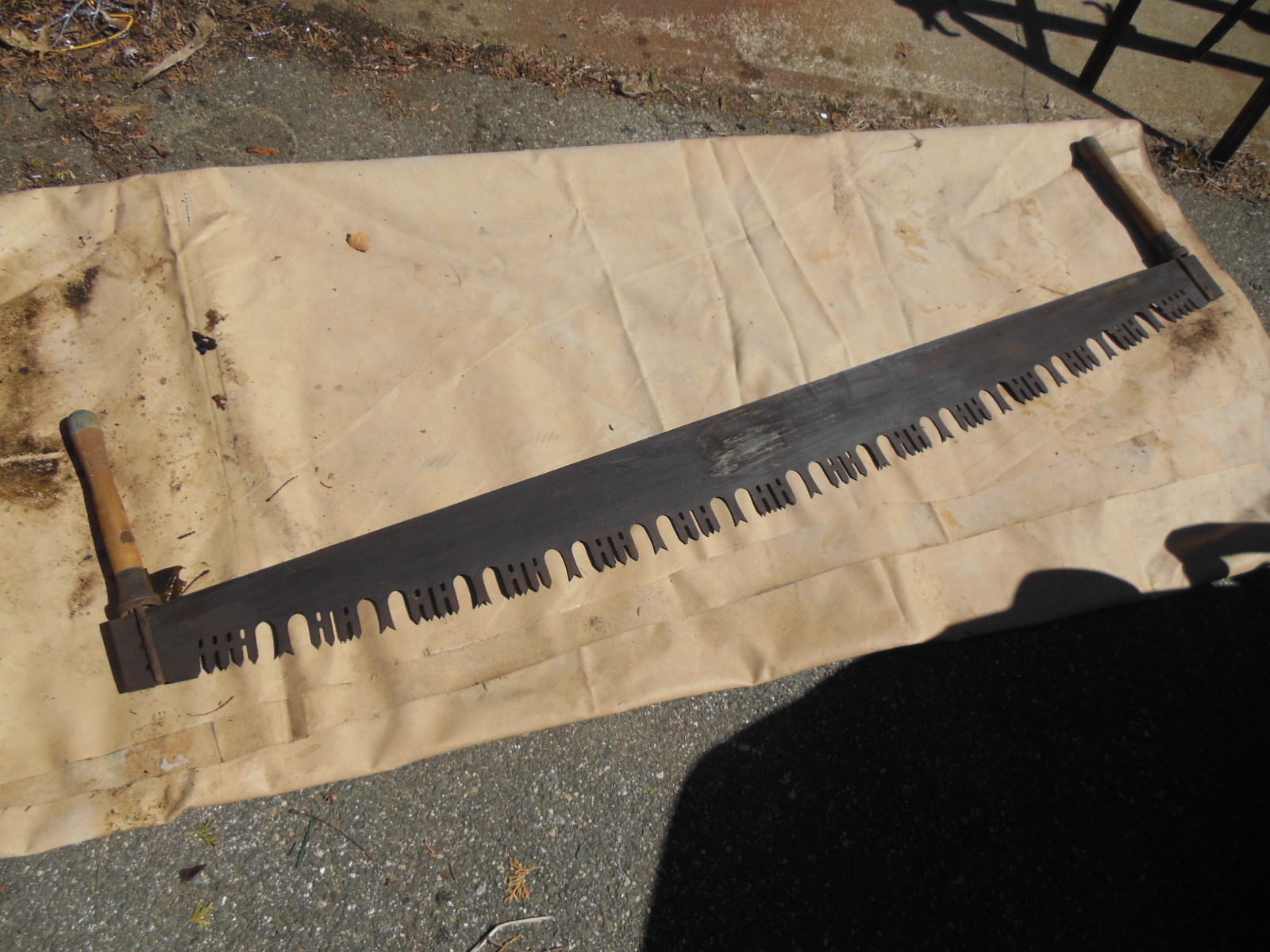
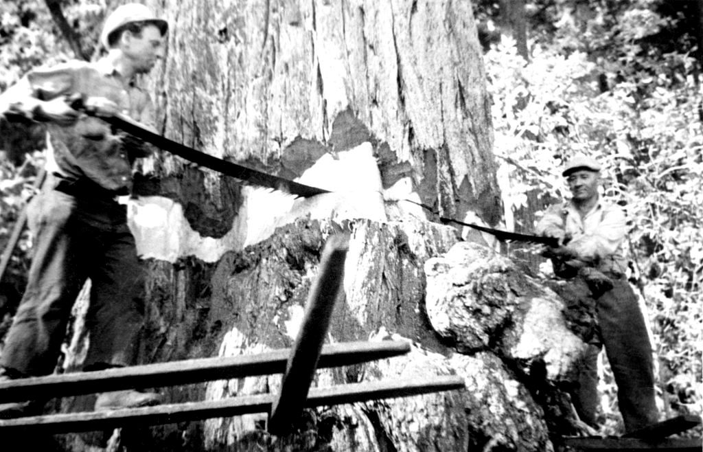
I always thought it was supposed to be three overlapping stylized two-man crosscut saws haha! @amirm and @Thomas savage busily sawing away at the b.s.! 

I even found a photo of them hard at work! I think that's Thomas on the left:

Apparently the really long saws were also called 'misery whips.' Back-breaking labor, I'm sure. Kind of like Amir hoisting all those loudspeakers onto his test rig, or hauling those heavy amps around!
I even found a photo of them hard at work! I think that's Thomas on the left:
Apparently the really long saws were also called 'misery whips.' Back-breaking labor, I'm sure. Kind of like Amir hoisting all those loudspeakers onto his test rig, or hauling those heavy amps around!
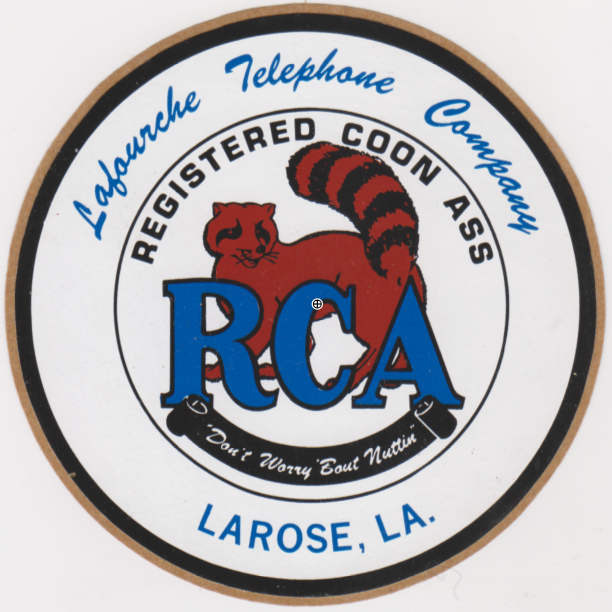
Nothing is likely to beat this logo, was on all their trucks, though this is a scan of a sticker I kept as a souvenir of life during pre-politically correct times...
https://en.wikipedia.org/wiki/Coonass

https://en.wikipedia.org/wiki/Coonass
Last edited:
Bowel movement?I like the ASR logo. That said, as good as it is you just can't beat logo perfection ...
View attachment 51712
restorer-john
Grand Contributor
The ASR logo always looks like a sheep walking towards me. I see it every time I look at the the logo. Check out the guy on the right and tell me that aint the ASR logo.

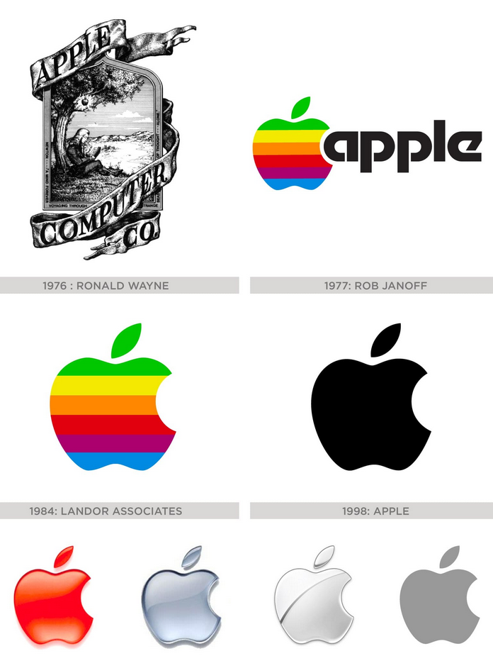
It's probably about time for a logo change. Look at Apple, they've had tons of logos:

It's probably about time for a logo change. Look at Apple, they've had tons of logos:
Last edited:
Bowel movement?
Ha! Hadn't considered that one.
- Joined
- Feb 23, 2016
- Messages
- 20,747
- Likes
- 37,568
Logo looks fine to me. Never gave it much thought.
I find it meh, certainly would vote for a more meaningful one.
What's wrong with it?Hmmm... I was expecting Savage Thomas' shoddy work on this.
Perhaps a reboot of the logo is in order?
Do you have it as a vector file? The text at the top also is not high res, gets blurry when zoomed in.What's wrong with it?
I always found it interesting that Jobs denied that the logo was not an homage/tribute to Turing.The ASR logo always looks like a sheep walking towards me. I see it every time I look at the the logo. Check out the guy on the right and tell me that aint the ASR logo.
View attachment 51718
It's probably about time for a logo change. Look at Apple, they've had tons of logos:
View attachment 51716
Amir, you are such an amateur . . . at logo design!
- Joined
- Feb 23, 2016
- Messages
- 20,747
- Likes
- 37,568
I guess some of you want an animated GIF logo. Gears turning, lightning flashes all around. Something tasteful like that?
I think the important thing is to have a logo and keep it because it becomes part of the brand. Even Apple has kept basically the same logo over time other than that tacky first old style western thing. The ASR logo could use some shading, some lighting effects creating shimmer and 3D dimension. Like what is seen in the later Apple logos. They have a 3D appearance and they shimmer slightly. It looks modern and professionalI guess some of you want an animated GIF logo. Gears turning, lightning flashes all around. Something tasteful like that?
The best rule of logo development is to NOT ask everyone's opinion about it!Amir, you are such an amateur . . . at logo design!
Similar threads
- Replies
- 398
- Views
- 25K
- Replies
- 12
- Views
- 428
- Replies
- 3
- Views
- 596


