-
WANTED: Happy members who like to discuss audio and other topics related to our interest. Desire to learn and share knowledge of science required. There are many reviews of audio hardware and expert members to help answer your questions. Click here to have your audio equipment measured for free!
You are using an out of date browser. It may not display this or other websites correctly.
You should upgrade or use an alternative browser.
You should upgrade or use an alternative browser.
Proposal: New SINAD Ranking Design (Histogram)
- Thread starter staticV3
- Start date
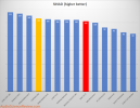
Does hovering over parts of that histogram change the information shown?Since its conception, the SINAD Ranking has grown from this:
View attachment 208069
to this:
View attachment 208066
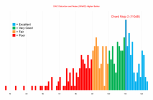
Instead of just making the graph wider and wider with each addition, why not switch to a histogram:
View attachment 208067
- Joined
- Feb 23, 2016
- Messages
- 20,696
- Likes
- 37,434
I like that. It would be even better if you could click on each column in the histogram and it expands out to list which devices fall into that SINAD level. But that might be a lot of work or clever programmers might make it easy.
@Doodski had the same idea.
Would be even better if it was easy (clever programmers again) so that as additional reviews come in the latest most up to date histogram goes into all previous reviews. That way if older gear has been superceded by something newer you'd see it in the older review.
@Doodski had the same idea.
Would be even better if it was easy (clever programmers again) so that as additional reviews come in the latest most up to date histogram goes into all previous reviews. That way if older gear has been superceded by something newer you'd see it in the older review.
RandomEar
Senior Member
- Joined
- Feb 14, 2022
- Messages
- 334
- Likes
- 775
I think it would be nice to have this as a part of the new review index: One version with all devices of one category in an ordered bar chart as now, but horizontally scrollable. One Histogram as presented above, with the option to click one bar and see all the devices in it.
In each review, there would only be a link to that index feature - or a screen cap, if Armir likes that better.
In each review, there would only be a link to that index feature - or a screen cap, if Armir likes that better.
Isn’t SINAD a negative value?
If so, I’d try and reflect that in the histogram. Switch the order, add (multiplication sign)-1and lower is better. I understand the proposed simplification but I’d vote for correctness in this case.
Edit: I see it isn’t, sorry. Still there must be a reason for the original chart to have highest ones on the left, no?
Edit: I see it isn’t, sorry. Still there must be a reason for the original chart to have highest ones on the left, no?
Last edited:
Just from a layout perspective, a veritical bar chart (by product name) makes more sense to me than the current horizontal as it's easier to read the product names in the correct orientation, plus easier to scroll vertically than horizontally.
I am not clear what you are showing here. What do the heights mean? How many devices with the same SINAD? How is that useful?
BTW, nothing interactive can be in the middle of a review page.
So there's n DACs tested with a SINAD of 112 but only x DACs with 111..? I'm not sure why that would be something to prioritize.
As a quick fix I suggest keeping the 4 zones horizontally (as they are now) but within each zone, list the individual devices vertically. That would make the graph/list more rectangular and easier to read.
As a quick fix I suggest keeping the 4 zones horizontally (as they are now) but within each zone, list the individual devices vertically. That would make the graph/list more rectangular and easier to read.
I would let the scale start at ~100dB (aka. CD quality)
So we get more resolution, there is no reason to bother with DACs that have below 100dB sinad
Everything below 100dB gets its own category (of shame)
Also exelent shuld be lifted to 120dB
So we get more resolution, there is no reason to bother with DACs that have below 100dB sinad
Everything below 100dB gets its own category (of shame)
Also exelent shuld be lifted to 120dB
restorer-john
Grand Contributor
It's a histogram. A spectrum of values is divided into bins. The more devices fall into each bin, the higher the column representing that bin.
I get that, but it isn't remotely intuitive to the average Joe. There is also no vertical scale (the number of devices).
It just looks like the New York skyline at a glance.
Honestly, I'd just leave the image the way it is, you can zoom in easily enough.
Last edited:
Gradius
Addicted to Fun and Learning
Just make it in Excel and put it on google, example:

 docs.google.com
Could be exported to pdf too, so you could just zoom in/out what you want to see.
Google Sheets: Online Spreadsheet Editor | Google Workspace
Use Google Sheets to create and edit online spreadsheets. Get insights together with secure sharing in real-time and from any device.
 docs.google.com
Could be exported to pdf too, so you could just zoom in/out what you want to see.
restorer-john
Grand Contributor
After thinking about it, I'd propose breaking the entire SINAD range into 10 colour groups (with another two in reserve for the future). DACs would get a 'colour' in the review which puts them in a 10dB band.
It fits in with the current colour scheme (R,O,Y,B) but adds all the colour codes for resistors and their values.
Black 0 (50dB+) (0.3%)
Brown 1 (60db+) (0.1%)
Red 2 (70dB+) (0.03%)
Orange 3 (80dB+) (0.01%)
Yellow 4 (90dB+) (0.003%)
Green 5 (100dB+) (0.001%)
Blue 6 (110dB+) (0.0003%)
Violet 7 (120dB+) (0.0001%)
Grey 8 (130dB+) (0.00003%)
White 9 (140dB+) (0.00001%)
And in reserve for the future of 32 and 64/128 bit DACs :
:
Silver (150dB+)
Gold (160dB+)
It fits in with the current colour scheme (R,O,Y,B) but adds all the colour codes for resistors and their values.
Black 0 (50dB+) (0.3%)
Brown 1 (60db+) (0.1%)
Red 2 (70dB+) (0.03%)
Orange 3 (80dB+) (0.01%)
Yellow 4 (90dB+) (0.003%)
Green 5 (100dB+) (0.001%)
Blue 6 (110dB+) (0.0003%)
Violet 7 (120dB+) (0.0001%)
Grey 8 (130dB+) (0.00003%)
White 9 (140dB+) (0.00001%)
And in reserve for the future of 32 and 64/128 bit DACs
Silver (150dB+)
Gold (160dB+)
Last edited:
Or maybe have it interactive and parametric like crinacle, rtings etc.
I want to have only the relevant (for me) products in one view.
For example
"Balanced out" and "USB powered" and "SPIDIF in" and "<200€"
No reason to have it cluttered by devices that don't do what i need them to do
I want to have only the relevant (for me) products in one view.
For example
"Balanced out" and "USB powered" and "SPIDIF in" and "<200€"
No reason to have it cluttered by devices that don't do what i need them to do
Last edited:
restorer-john
Grand Contributor
I want to have only the reverent Products in one view.
Amen.
Similar threads
- Replies
- 116
- Views
- 11K
- Replies
- 32
- Views
- 7K
- Replies
- 0
- Views
- 291
- Replies
- 75
- Views
- 8K


